Project House Update No.1
It’s been a LONG time since I did an update, and I could’ve posted some more over here in the prior months, most of it was just gutting the house, putting in new subfloors, and revising my design plan like 100 times. We ditched our original plan to add a bedroom and move the kitchen because it turned out to be out of our budget, so we’re doing a plain ol’ “lipstick flip” (as they say in the biz). So basically, keeping the original floor plan and just updating all the surfaces to be new and prettier. The original floorplan was not bad (minus the odd pony wall that separated the dining room and living room and broke up the whole flow of the space), so I’m not disappointed about the floorplan. The whole idea with adding a bedroom was just to add value to the home (3 bedrooms can fetch a higher sale price than 2), but you can’t add any value if you go over budget, so we scrapped my grand plans and went back to basics.
The other change in plans: we are now living in the house! I’ve mentioned it before in my post about #thebravehouse becoming an Airbnb, but we decided since we have two houses, it makes the most financial sense for one of them to be generating cashflow or at least paying for it’s mortgage and utilities. So even though we’re living in an unfinished house and all my socks have sawdust stuck to the bottoms, I’m very happy to a.) be spending SO much more time with Dan (he used to go straight from work to the house to work on it, then come home, go to bed and repeat. Needless to say, this girl whose love language is quality time was feeling a bit starved for our marriage to have time together), b.) be able to put in work on the house myself while Jack is either playing outside or in his room and during his naps, and c.) be generating an income with the other home I spent years crafting and curating!
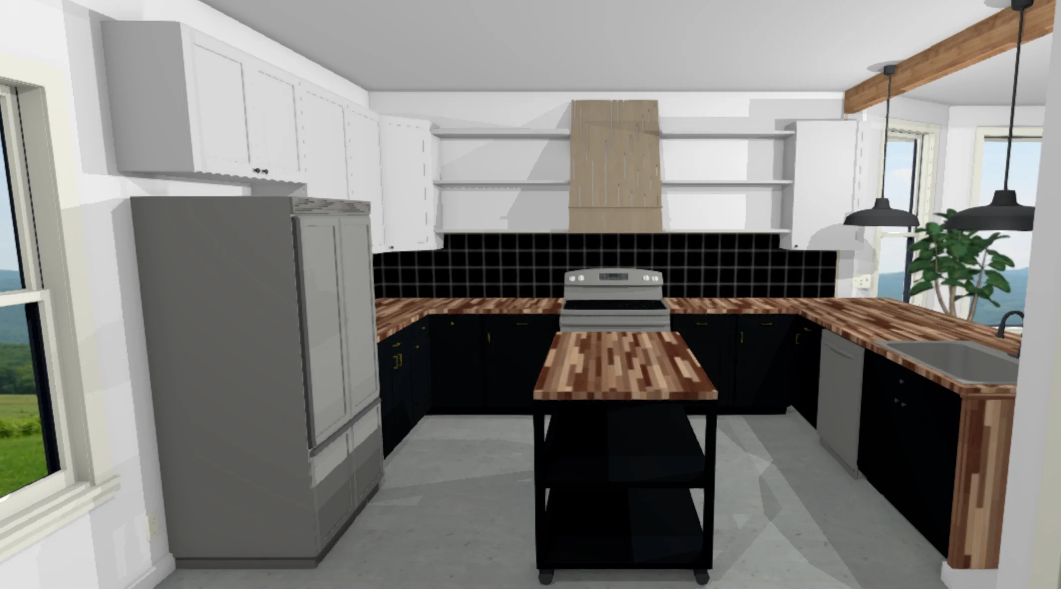
So as a little reminder: here is the original kitchen. This photo was taken the day we got the keys. The lower cabinets are the same, we just painted them black (Behr Broadway, the same color we have on the exterior, just in an eggshell sheen. Exterior is a semi gloss). We decided to get new uppers because I wanted them to be taller. The old cabinets felt too short and I wanted something that drew your eye upward and made the room feel taller. I have a couple more to put up, one over the fridge and one on the right side by that window, and then we’ll do a hood over the range and open shelving on either side of that, butting into the cabinets, like so:
We’re gonna pop an island in there because this kitchen is HUGE. The floor is going to be a concrete-look 12x24 tiles, and then I’m thinking of doing a black tile backsplash, which would definitely be a bold move, considering the cabinets are also black, but I definitely don’t want to do a basic white tile. After all the basic stuff is taken care of we can move on to more fun stuff like putting in pendant lighting over the bar/peninsula and replacing the gross fluorescent light in the center of the kitchen, maybe putting in some can lights for optimal light in the space, and wrapping the odd little beam above the peninsula so it looks more intentional and not just a weird bump on the ceiling. Oh and giving everything a fresh coat of white paint.
We’ve got a lot of work to do. We definitely didn’t do this whole thing in the most efficient way and it’s been a huge learning experience, but we’re trucking along and chipping away at each project on our very long to do list.
The Brave House is... an Airbnb!
That’s right! Our cozy little home is now on Airbnb! You might be wondering, “well wait… where are you going to live then?” and that answer is: the flip house! I haven’t been able to do much work on the flip house because my only free time is during Jack’s naps… and I kind of have to stay home while he naps, you know? So we are finishing the flip house enough that we can live in it (flooring in, at least one bathroom finished, kitchen functional) and then we’ll be finishing it as we live in it.
In the meantime, The Brave House will be rented out to travelers looking for a place to call home while they’re on the road! We’ve already listed her and have quite a few bookings already! I’m excited to share the home I’ve put so much heart into with others, especially because I love Tacoma and am looking forward to sharing my love for the city with those who might be experiencing it for the first time.
If you or someone you know is coming to visit the Seattle/Tacoma area and is looking for a place to stay, send them my way! I wanted to make our place very family and pet friendly because as a parent and dog-owner, I know how frustrating it can be to find a good place to stay that can accommodate my dog and is also designed with a kid in mind. I’m in the process of creating a really fun bunk room that, while available for adults, will be an especially fun space for kids. Jack’s nursery upstairs has been converted into a regular bedroom with a queen bed, there’s another bedroom on the main floor with a queen, plus the bunk room, so it’ll be able to sleep 6, and we also have a pack-and-play available for anyone with a baby or toddler who doesn’t have one or want to travel with theirs.
I’ve got a lot of fun ideas I’m thinking of incorporating but for now, we’re in the thick of finishing up some projects on our (now) Airbnb house and working our butts off to have the flip ready to move in by mid-late May! In the meantime, check out our listing and share it with anyone who’s doing some PNW travel this summer!
10 tips for taking beautiful photos of your home
If you’re an interior designer, proud homeowner wanting to showcase your decor, or just wanting to improve your interior images for instagram, here are a few of my tips for snapping the best shots of your interiors! A couple of these tips will relate specifically to DSLR shooters, but most are applicable to anyone— even those of you using your phone camera to capture your images!
01/ SHOOT STRAIGHT-ON TO WALLS
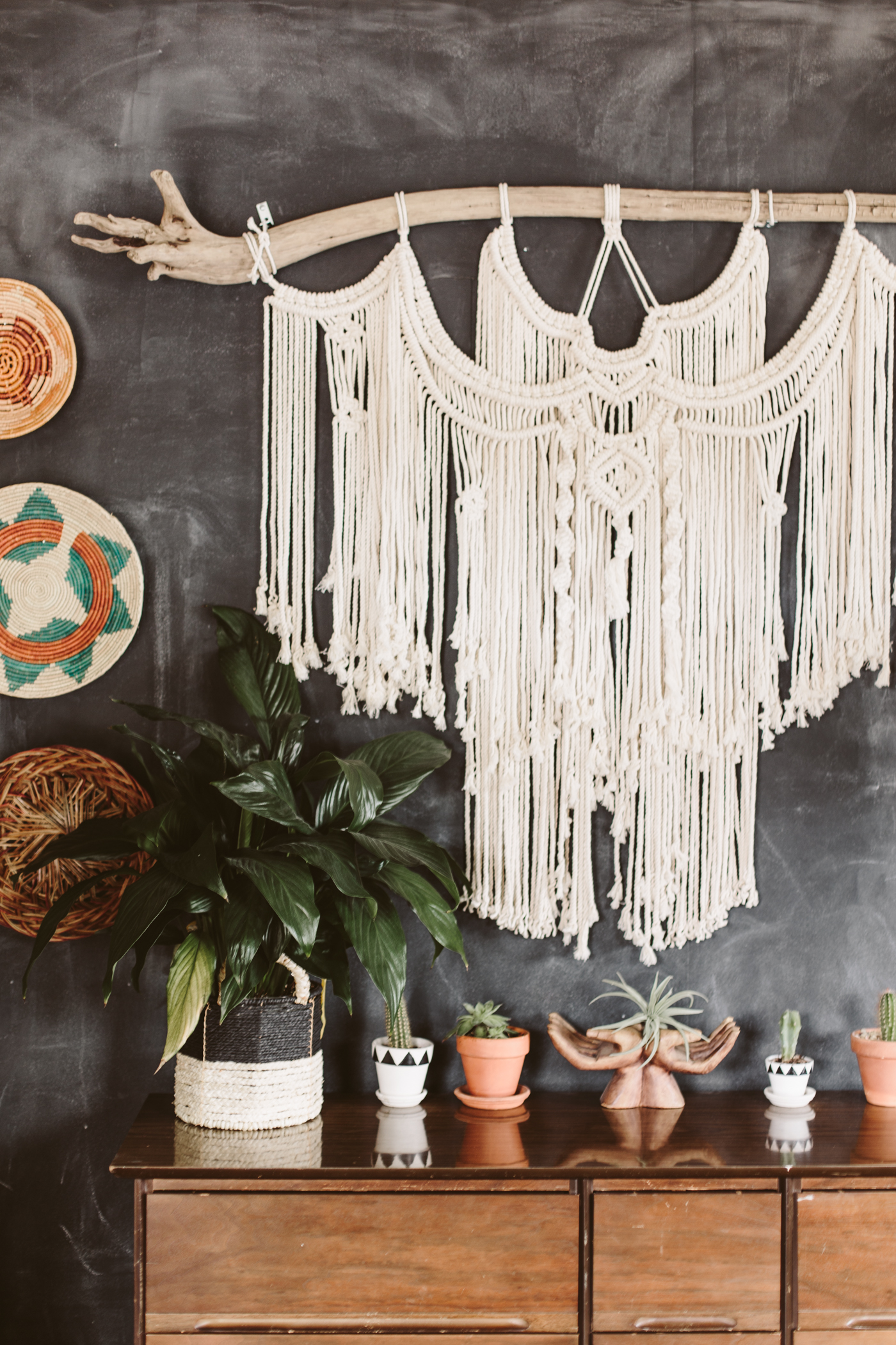
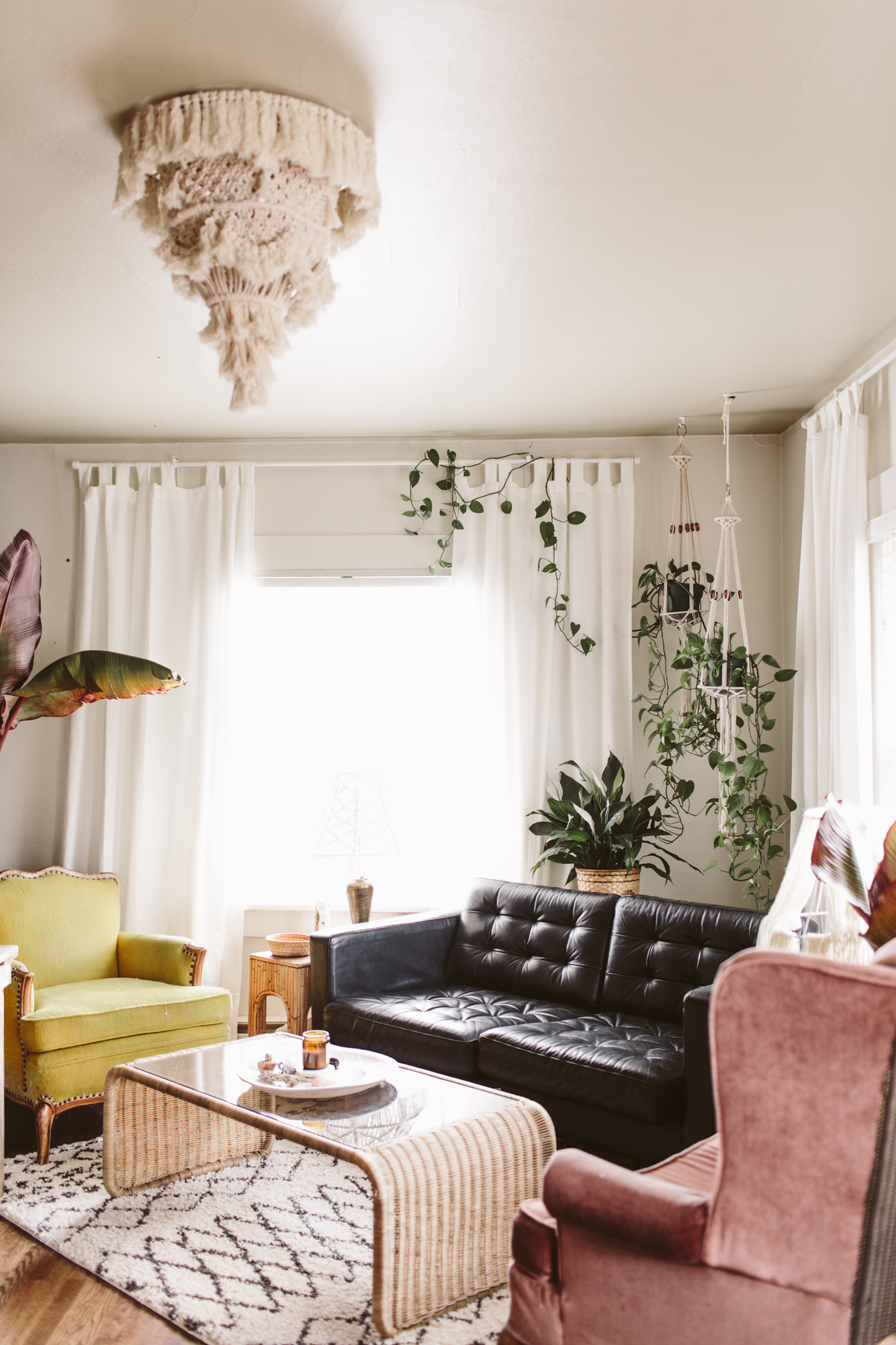
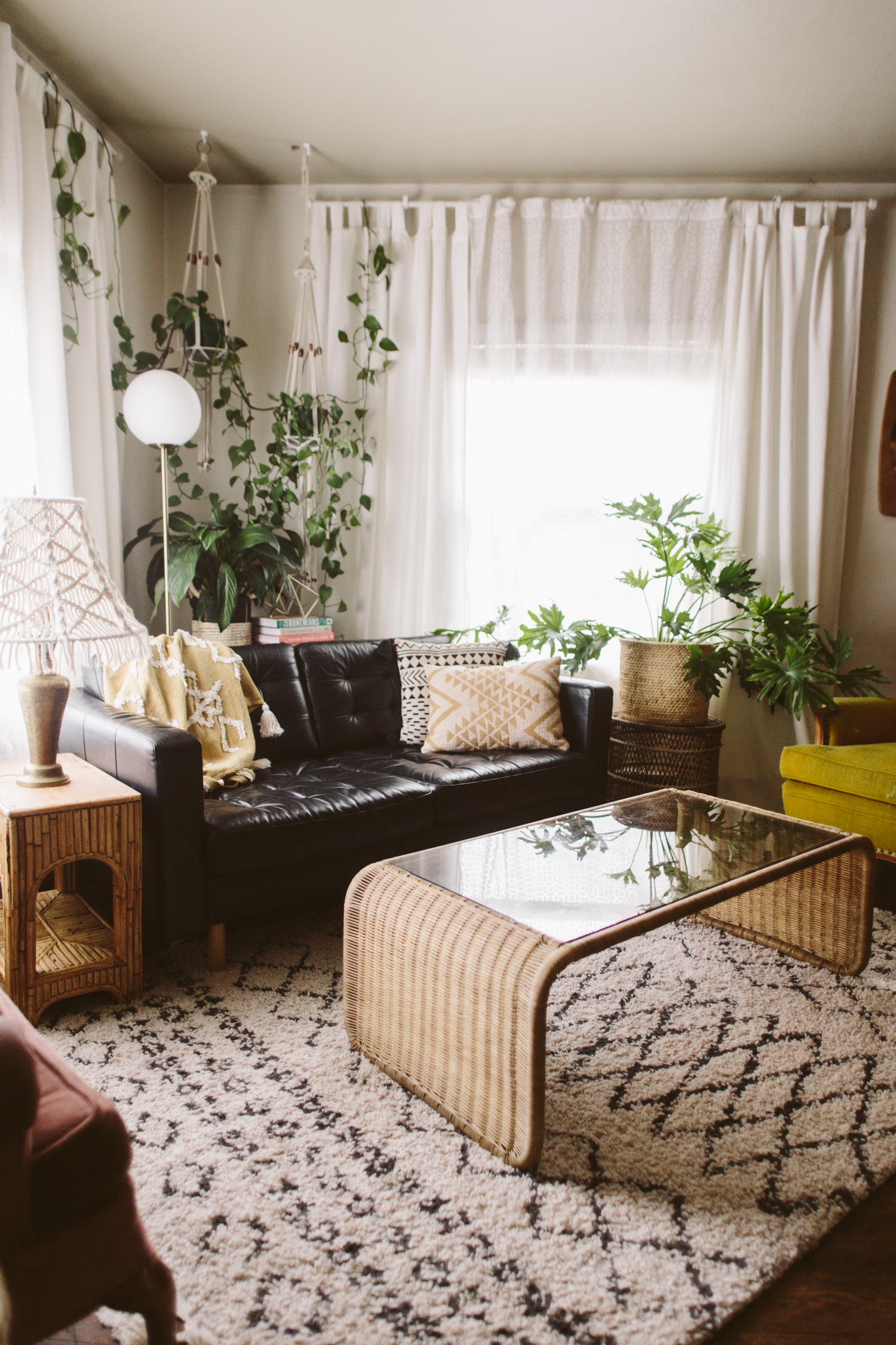
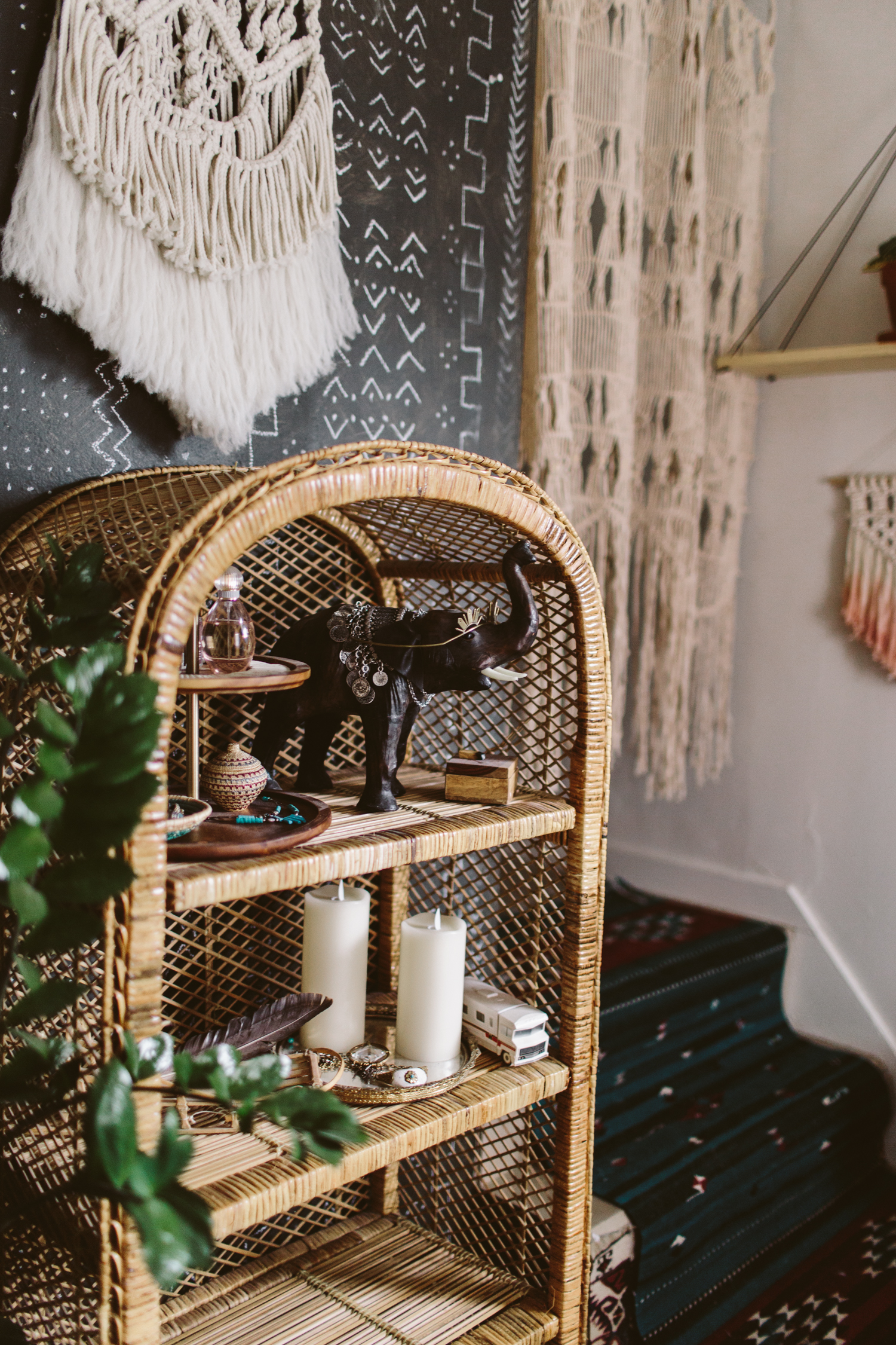
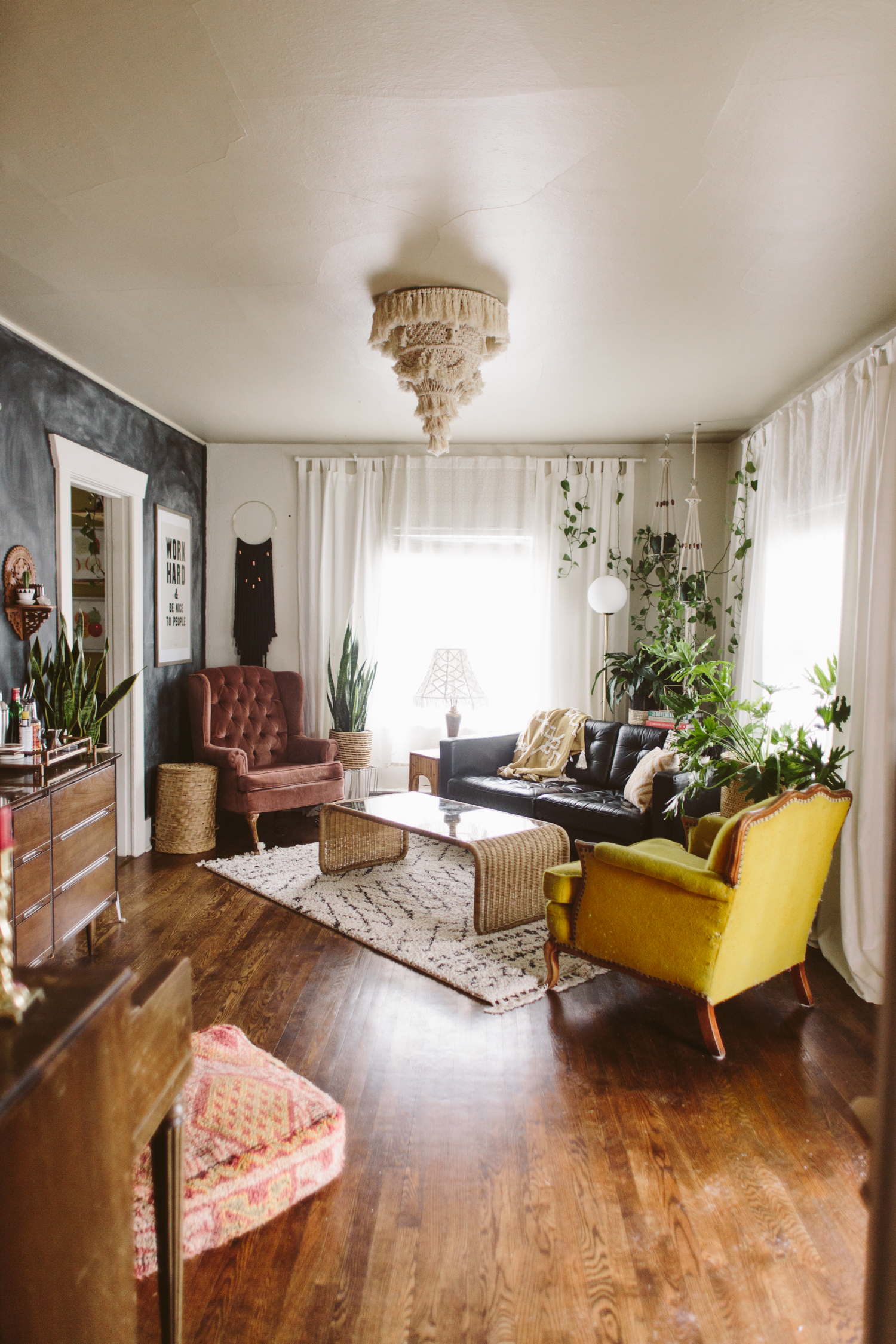
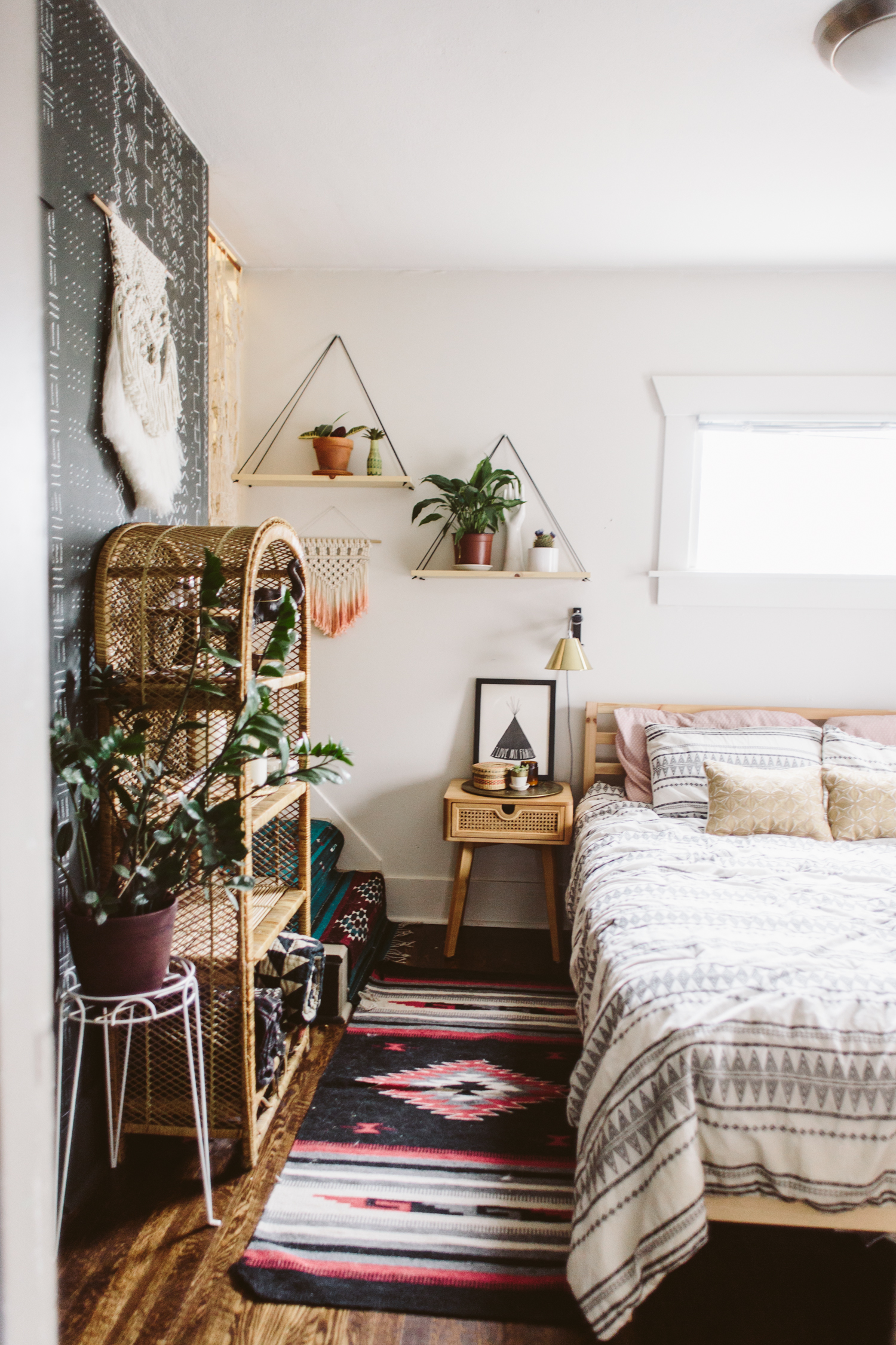
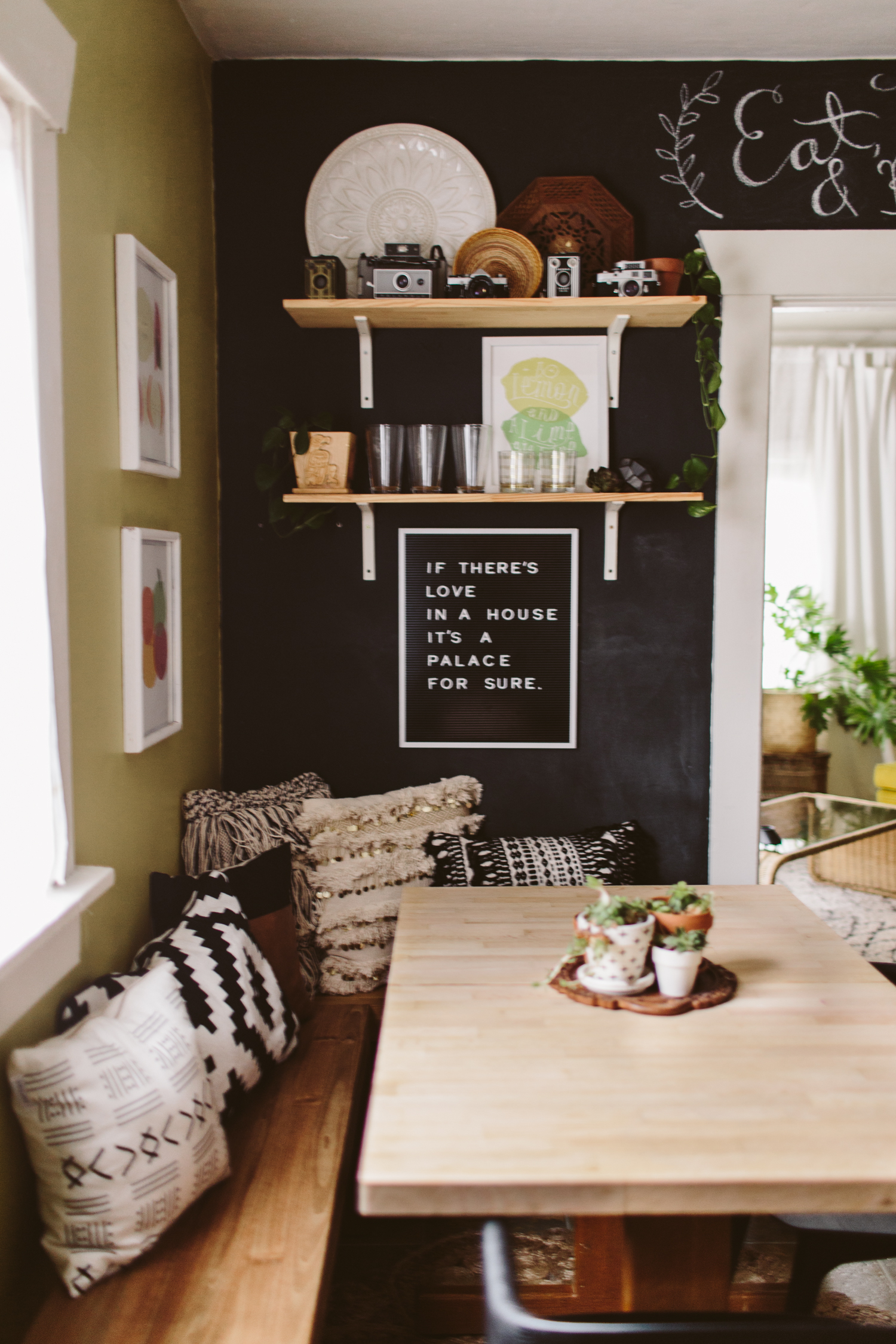
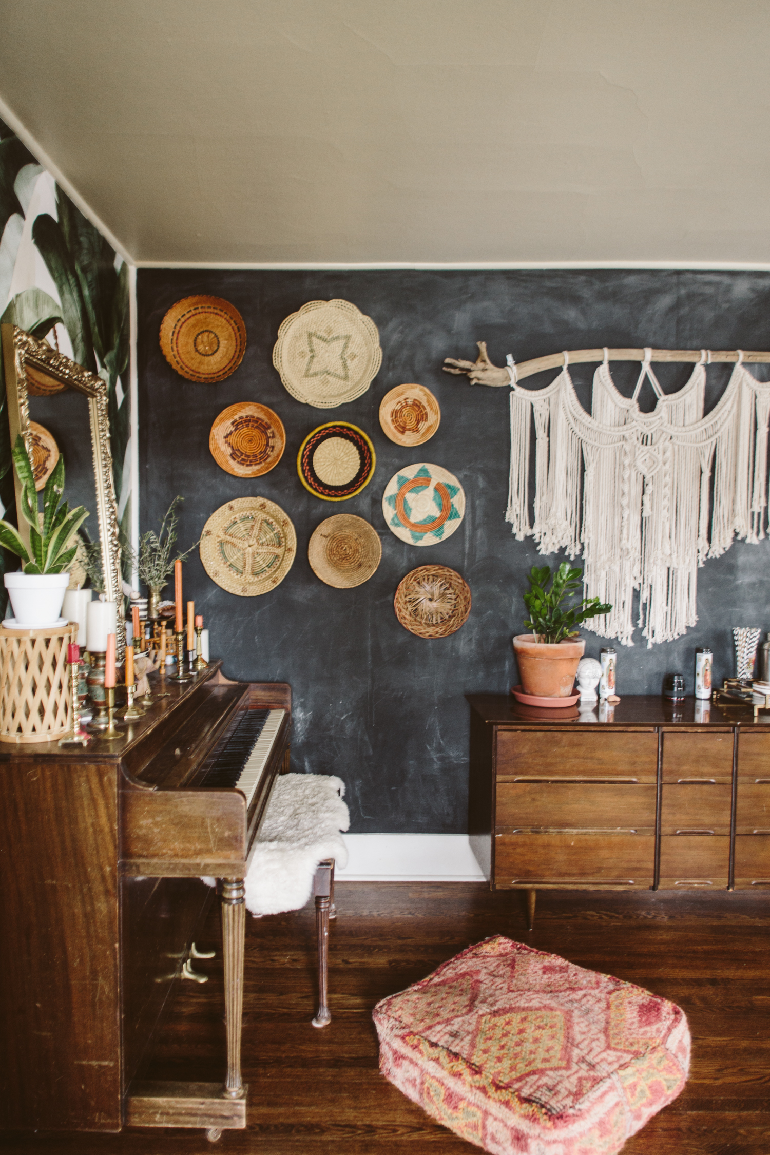
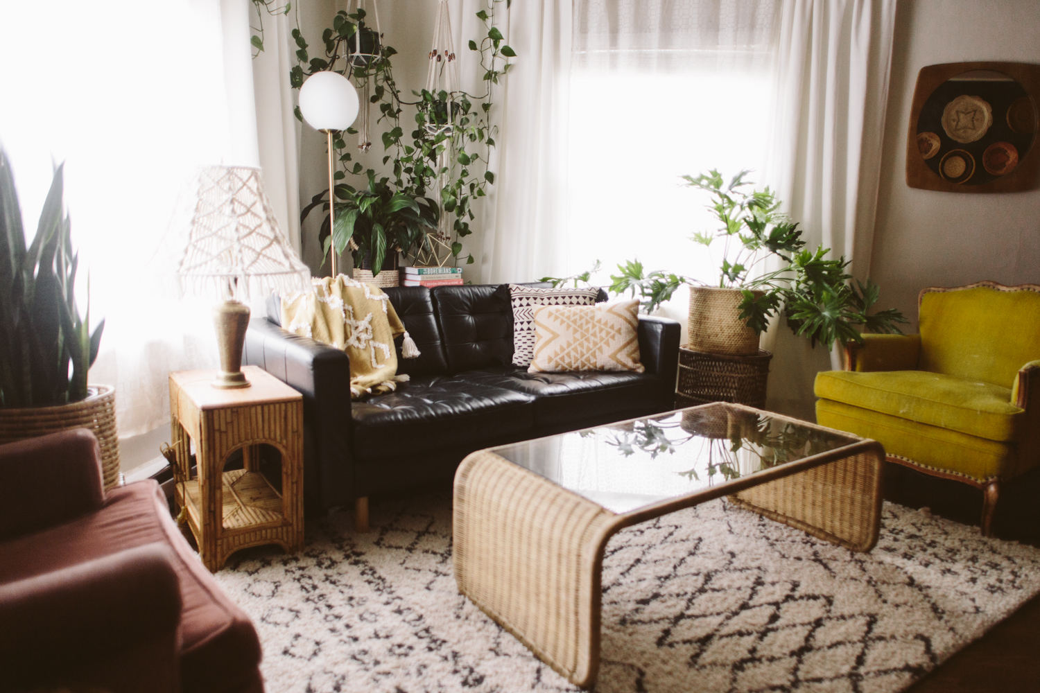
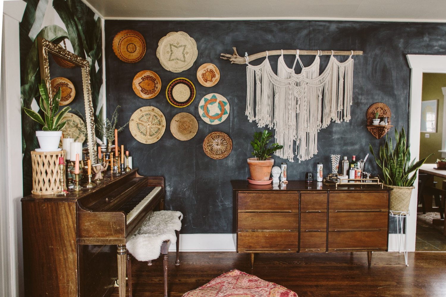
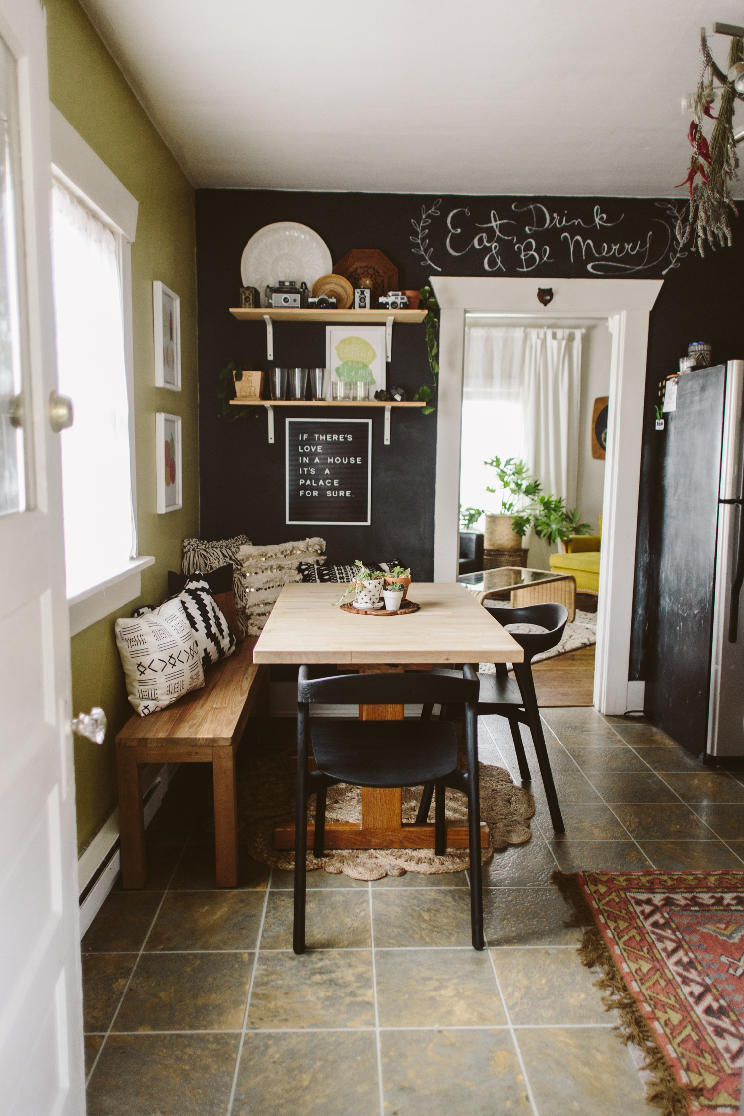
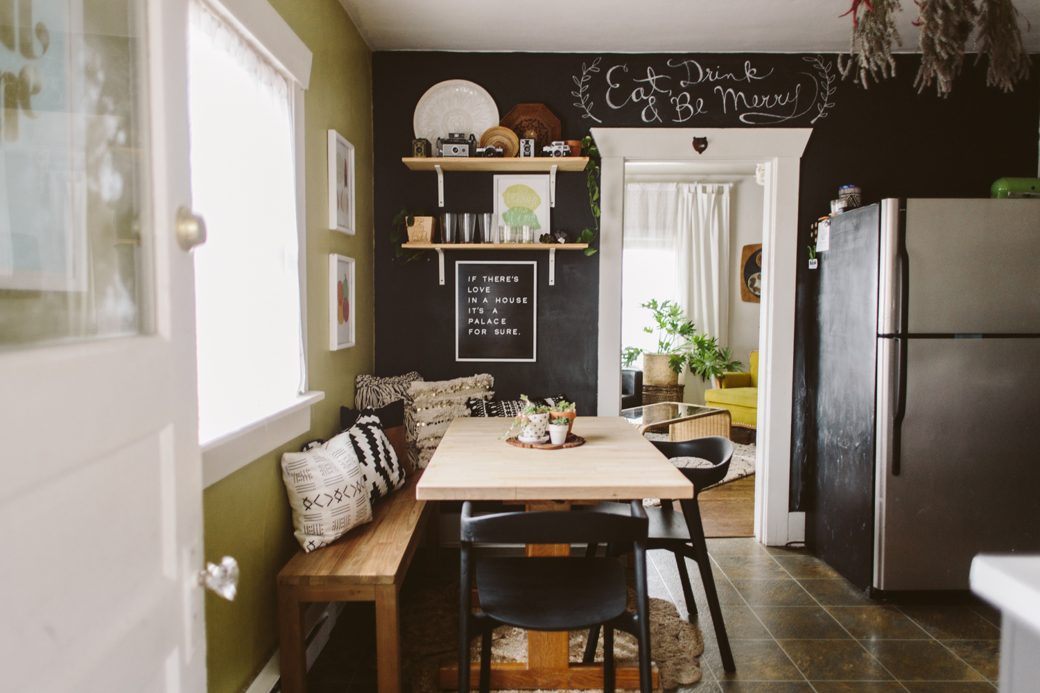
So basically: when you’re shooting, shoot directly at a wall, not diagonally towards a corner. This isn’t a rule, I shoot into corners all the time, but I do love the clean, straight lines of a straight-on shot. If you scroll through these photos you’ll notice almost all of them are directly facing a wall. There’s just something aesthetically pleasing about the perspective lines of a straight-on photo. Again, this can be a personal preference thing, but I notice that many of the photos I like and that are popular on Instagram or in magazines follow this guideline.
02/ ADD A HUMAN ELEMENT
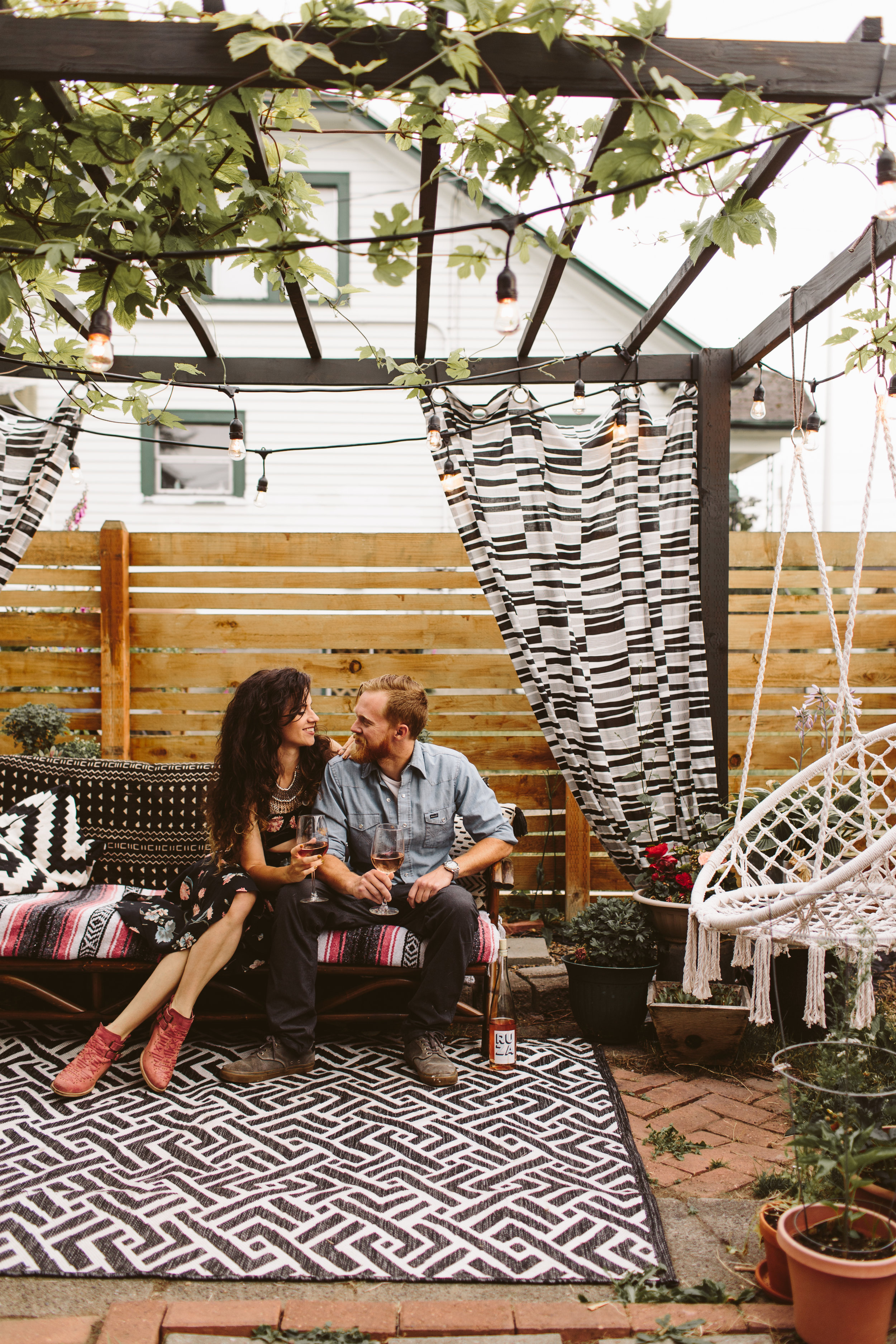
These photos in this post in particular don’t do the best at showcasing this tip, but it is one thing I like to do, and find that I enjoy in other people’s photos. Put people (or pets) in your photos! My Corgi makes it into a lot of the photos I take of my space and I love how she adds a little bit of realness to the photo. I also enjoy putting myself in the photo (standing at the counter cutting fruit, making the bed, playing with my son) just to give a lived-in feel to my images. We do, after all, actually live here! It can be harder to set up, and getting a toddler to cooperate for photos might be more of pain than it’s worth sometimes, but I try to do it when I can.
Even if you can’t get an actual person in your image, you can at least give some kind of staging that alludes to people’s existence, haha. Maybe have an orange sliced up on a cutting board with a knife laid beside it when you take photos of your kitchen. Or a book cracked open with a cup of coffee and a scone on your coffee table when shooting your living room. Just little evidences of human life peeking through your photo.
03/ USE NATURAL LIGHT
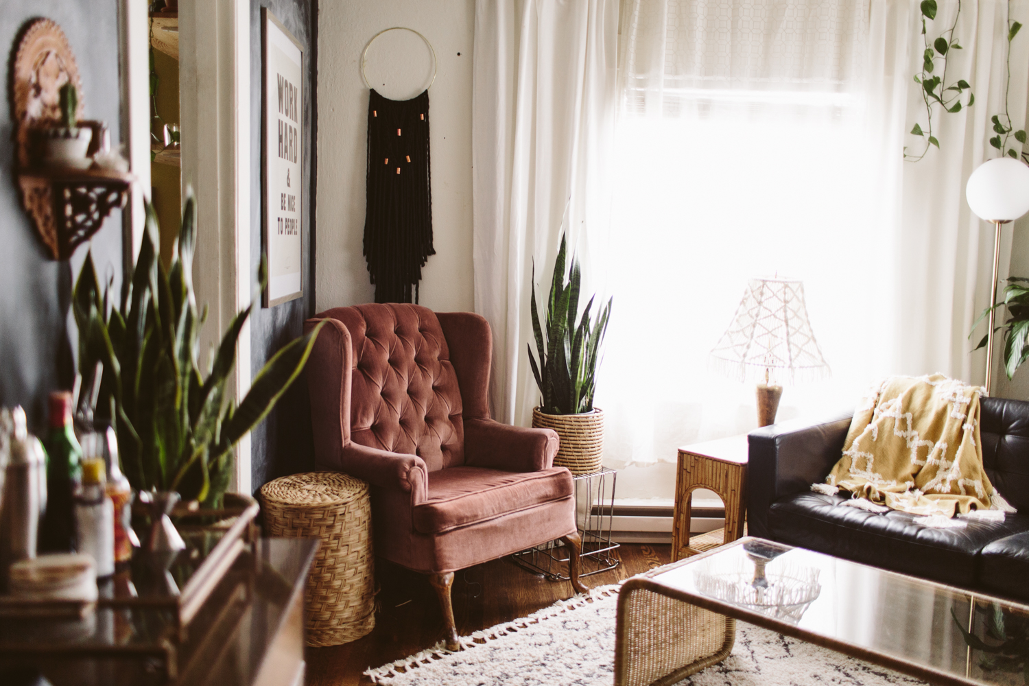
Most of our indoor lights have a very warm, orangey tone, so when lights are on they can tend to tint everything orange. I prefer my images to look as natural as possible in order to get an accurate depiction of paint colors/upholstery etc, so I’ll turn off all the lights and use only window light. If you are a whiz at off-camera lighting and feel comfortable lighting your space that way, by all means!
Because turning the lights off in your home will often mean your space is a lot more dim than usual, you’ll probably have to put your camera on a tripod so you can use a long exposure in order to get the correct exposure in your image.
You can also open doors that aren’t in the photo in order to let light in from other rooms or outdoors. I’ll often open my front door when taking photos of my living room because it lets in way more light BUT! I have to put a white sheet over my door because it’s painted orange, so that orange color gets cast onto my space unless I throw a sheet over it. Light can do funny things like that, so just keep an eye out for funky shadows or weird colors getting cast onto your space.
04/ CLEAN UP CLUTTER
This one is kind of a personal preference depending on how “real” you want your images to be, but I do like to take photos of a space that has odds and ends and clutter tucked away. It helps put the focus on the design elements on the room and draws the eye to the areas you want. For example, my kitchen counters house waaay more stuff in my daily life than is shown in these photos, but I wanted to show the concrete counters and backsplash tile. With coffee makers and dish drying racks all over the counter, it’d be harder for the viewer to focus on those design elements. This can also apply to stuff like cords and remotes. Just tuck ‘em away for the shoot!
05/ MOVE STUFF AROUND
This might be considered “cheating” but I do it a lot. Move design elements from room to room! I definitely do this most with plants. I don’t have as many plants as I’d like in every room of my house, so I’ll usually do a little bit of plant musical chairs, adding plants to the room I’m shooting. You can also do this with stuff like throw pillows, blankets, etc. Since you’re not showing your entire house in one image, you can fudge a little by borrowing stuff from rooms not shown in the photo you’re taking. Tricksy!
06/ USE A WIDER ANGLED LENS
I don’t like to get too crazy, if you have too wide of a lens it can distort things and start to look fish-eyed. The widest I’ll use is a 24mm lens, which seems to be a good lens, especially for shooting smaller spaces. I like to use a 50mm for shooting details, and a 35mm is a happy medium between 50 and 24mm.
07/ SHOOT THE BIG PICTURE
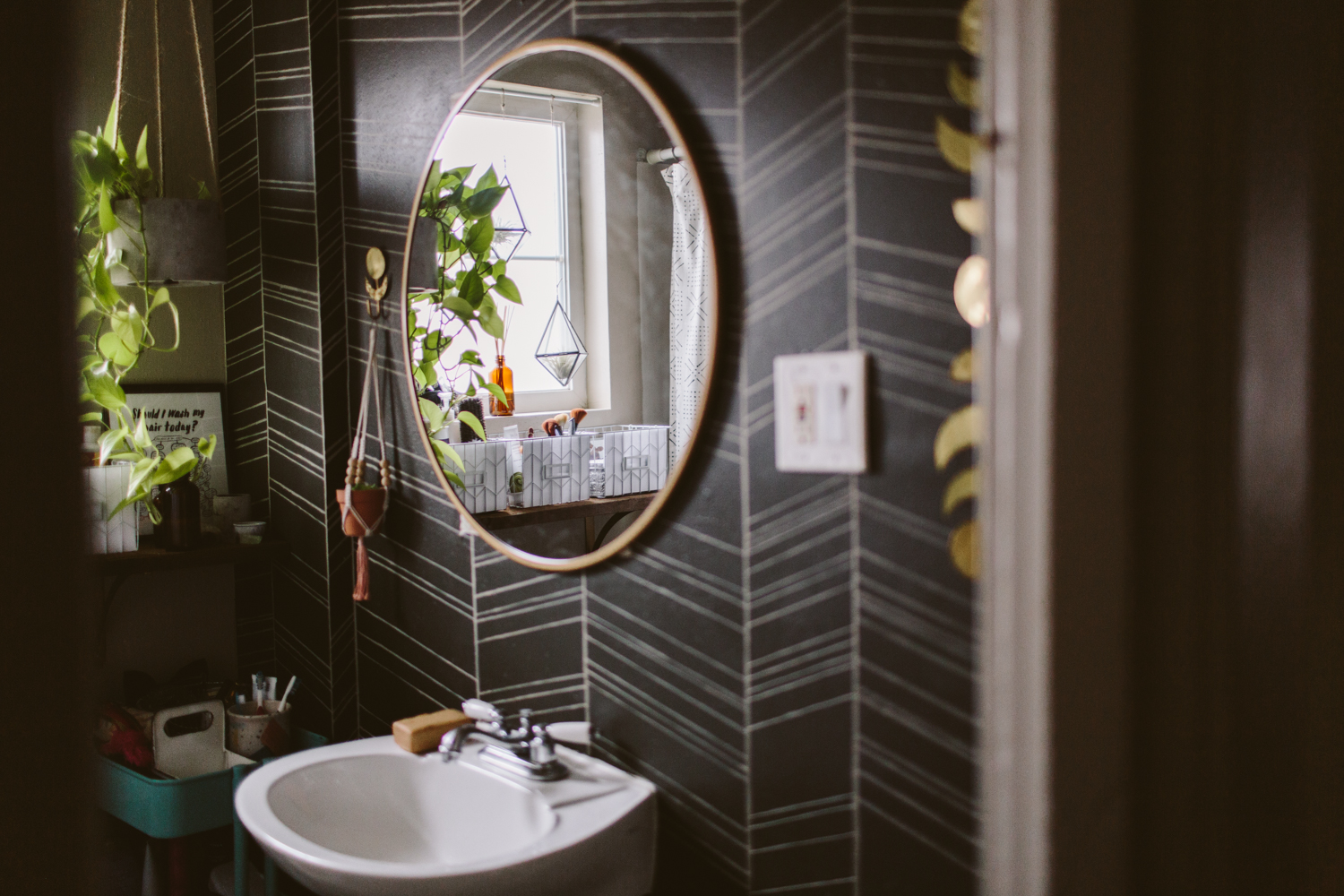
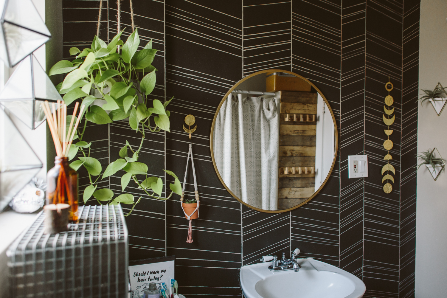
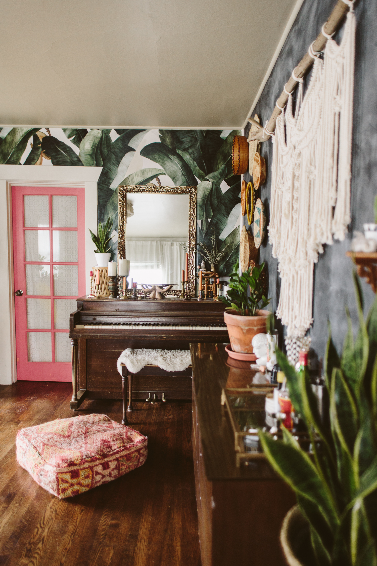
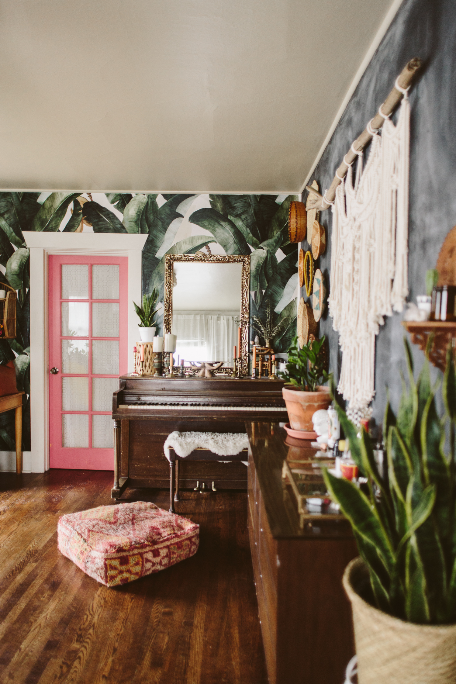
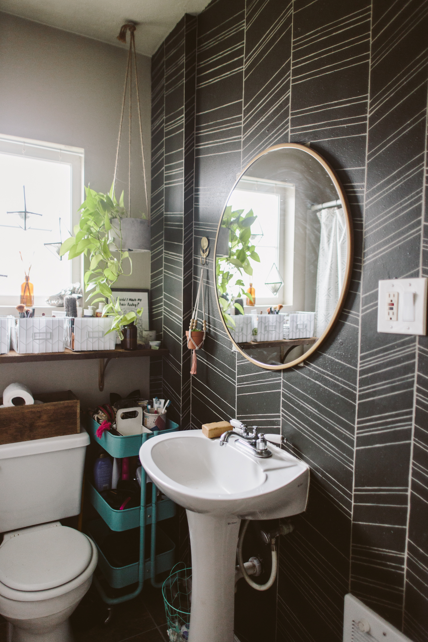
I’m all about a nice vignette (I mean, c’mon, I spent a while styling that shelf!) but people like to see the big picture. If you have a small space, it might mean you have to step into the doorway of the neighboring room in order to get far enough back to fit your room in frame. See that pink door in my living room? In order to get a full shot of my entire living room I have to use my 24mm lens and then be standing about a foot into that doorway to get the shot. In order to shoot my tiny bathroom, I’ve climbed into the very back corner of my shower in order to get the shot. Whatever works!
08/ DIFFUSED LIGHT IS YOUR FRIEND
I do enjoy the occasional harsh sun, shadowed photo, but in general, it’s best to shoot at a time of day when the sun isn’t beaming directly into your windows and casting a bunch of really harsh light. A partially cloudy day makes for really wonderful light (though here in the PNW we can get too many clouds and it’s almost too dim to shoot some days)
09/ MOVE STUFF OUT OF YOUR WAY
Sometimes you want to get just the right shot, but the arm of a chair is getting in the shot. Don’t be afraid to scoot things out of your shot. When you’re shooting, look at the image you just took on the camera’s screen and make sure there’s nothing peeking into the shot that’s distracting the eye.
10/ SHOOT RAW
This one is a little more technical, and you might not have the right photo editing software to edit raw images, but shooting in raw (instead of jpeg) makes it way easier to correct things like over or underexposure. Most DSLR cameras have the option to shoot raw, you just have to scroll through your settings to select the raw option. Again, this one is a little more techy, so if you’re not super comfortable with your camera or if you don’t have software that can work with raw image files, don’t worry about it!
For editing, I like to use Lightroom for my “big camera” images. When it comes to phone images, I always edit using A Color Story app. They’ve got lots of filters, and you can combine, tweak and save your filters too so you don’t have to repeat all the steps you take every time to achieve a cohesive look on your photos. Another app I’ve used in the past for photo editing is Afterlight.
Dreaming of a White Christmas
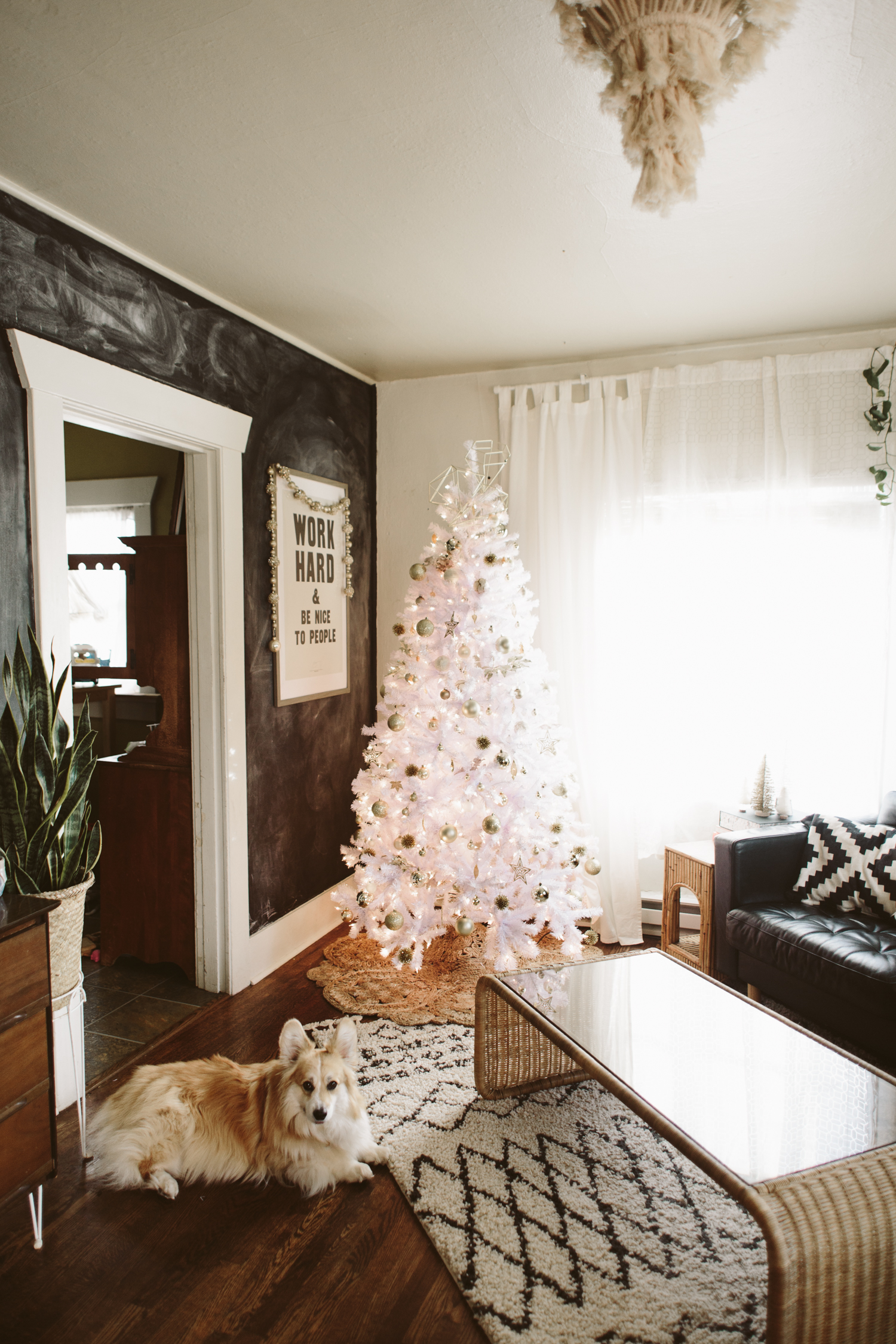
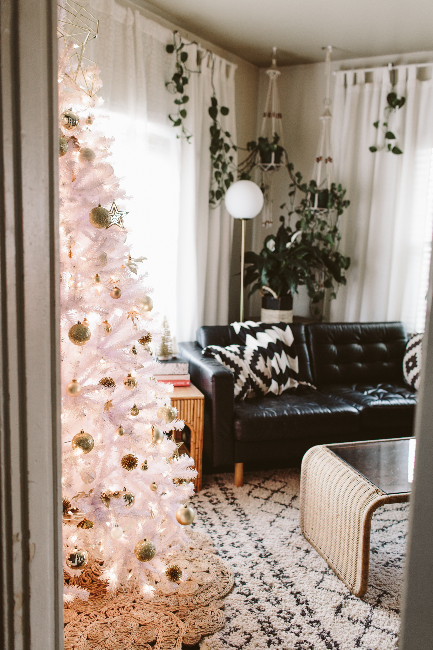
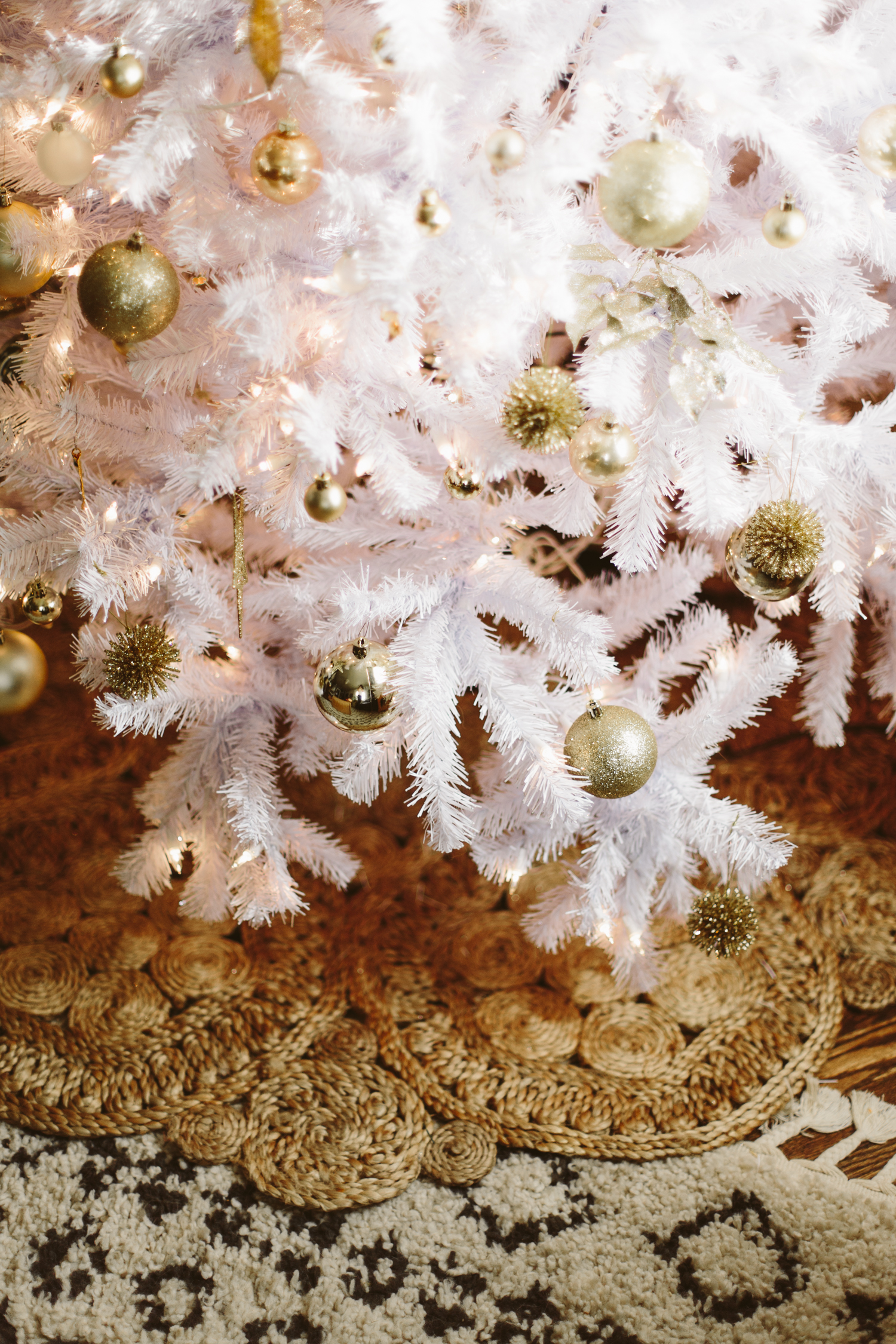
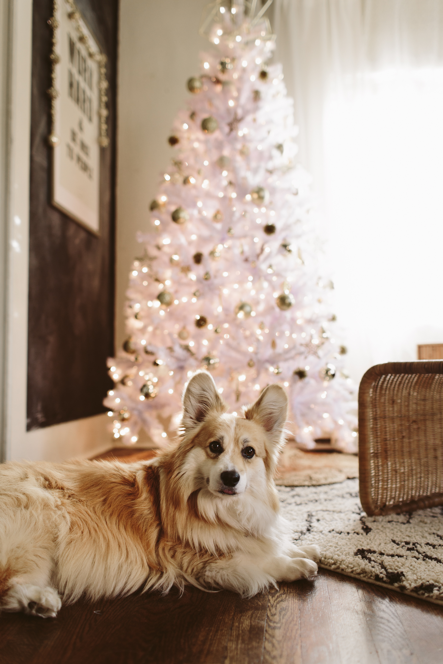
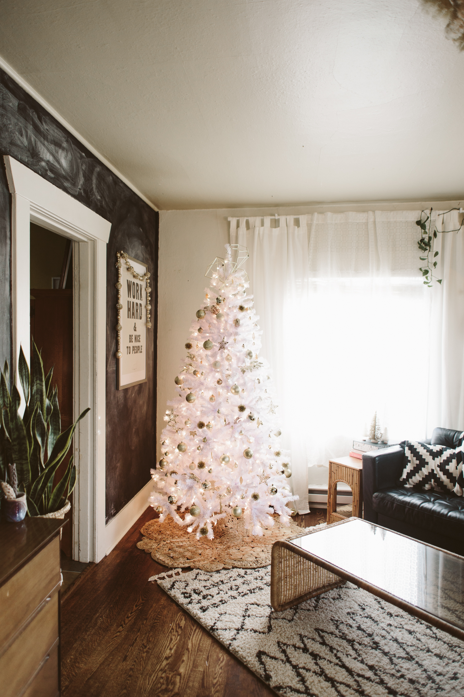
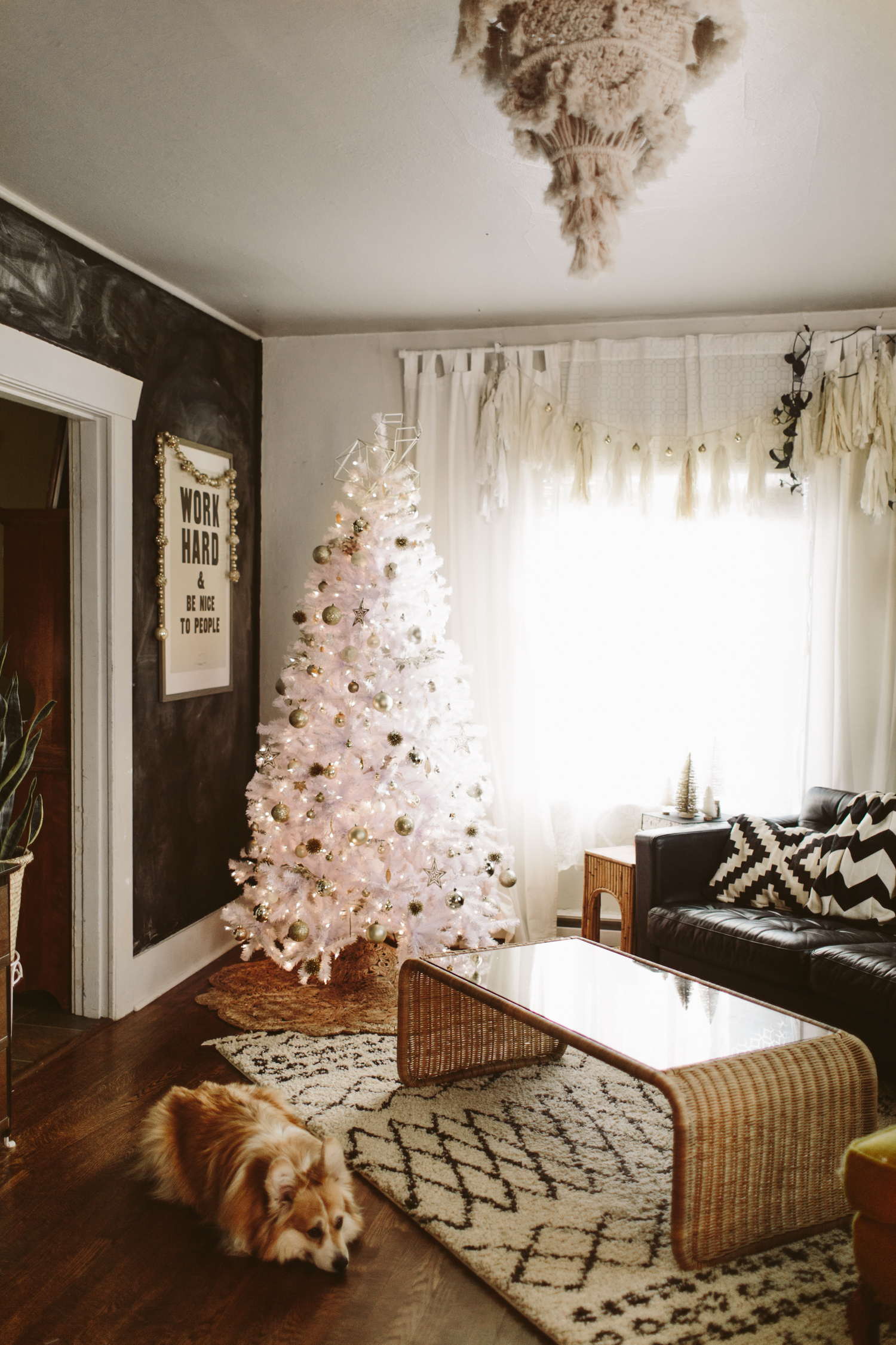
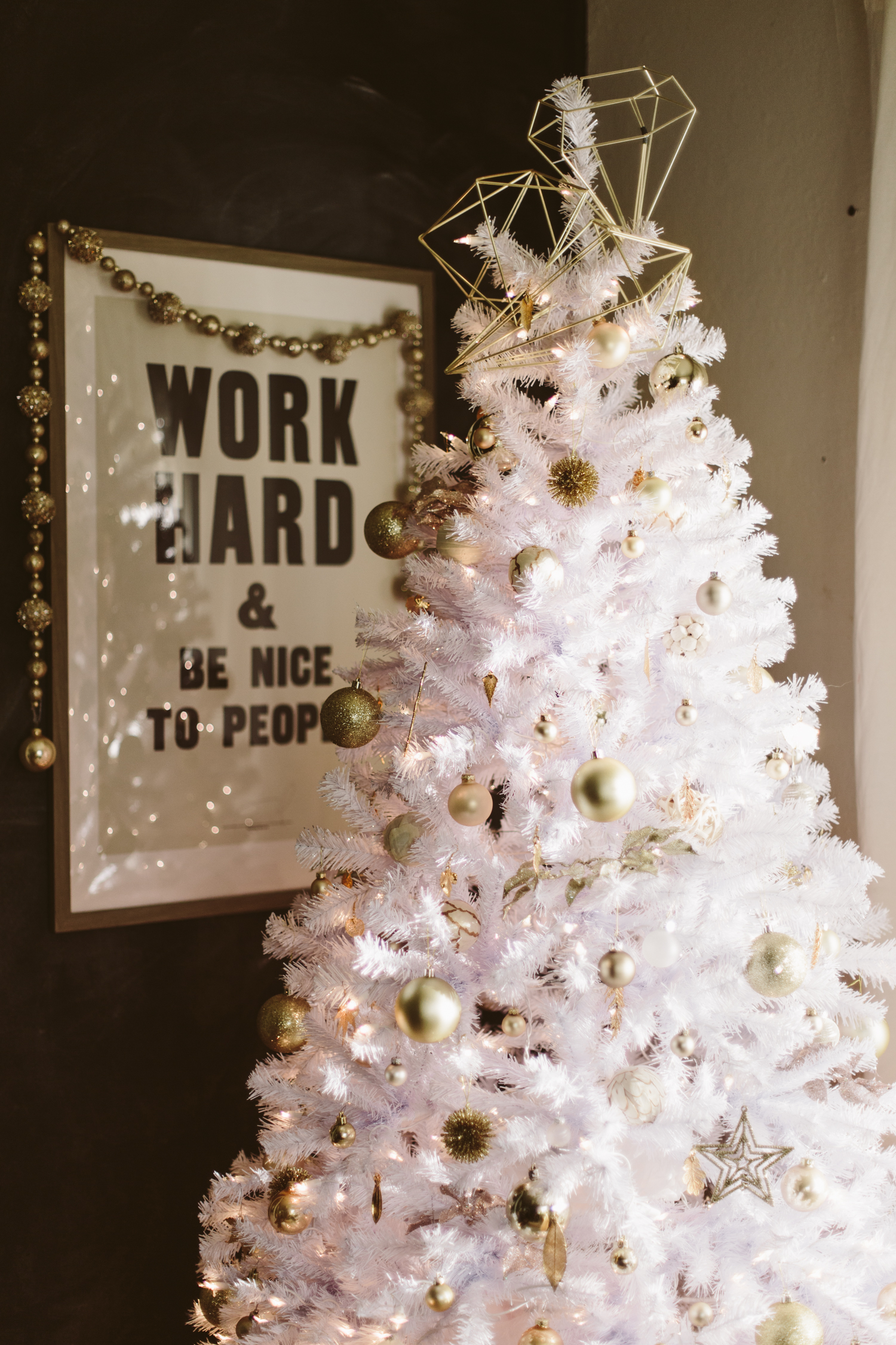
I have wanted a white Christmas tree for probably 4 or 5 years. It feels like forever. This year I decided to finally go ahead and just go for it, and I’m SO glad I did. I’m head over heels in love with it. I knew with my black chalkboard wall it would go perfectly, and I’m really happy with how it fits in my space! It’s still early in the season and not even December yet, so I’m sure I’ll make some additions to my holiday decor as we approach Christmas, but I wanted to share my little white tree because I’m so happy with it!
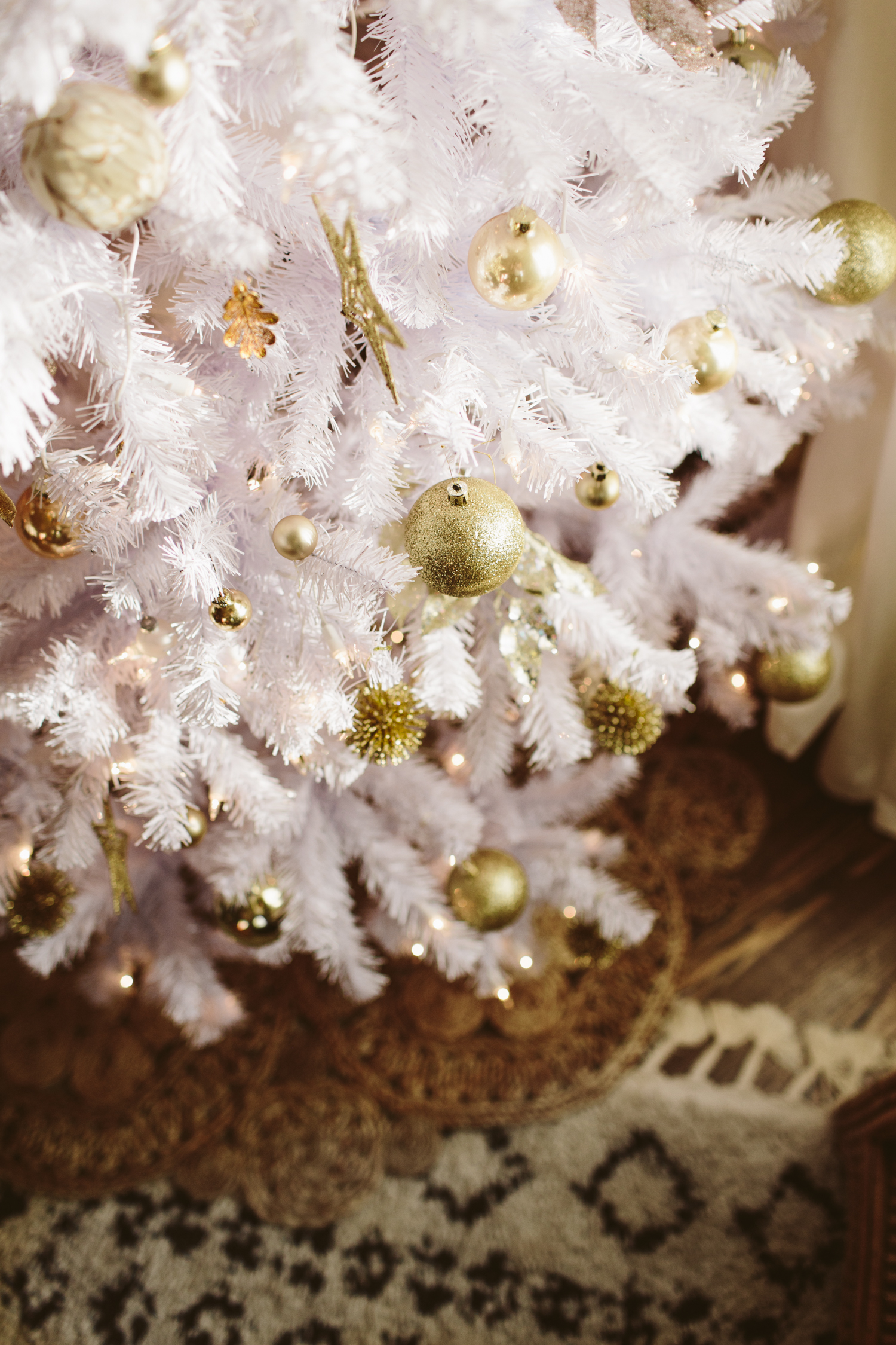
White Christmas Tree: Wayfair
Jute Rug as Tree Skirt: Wayfair
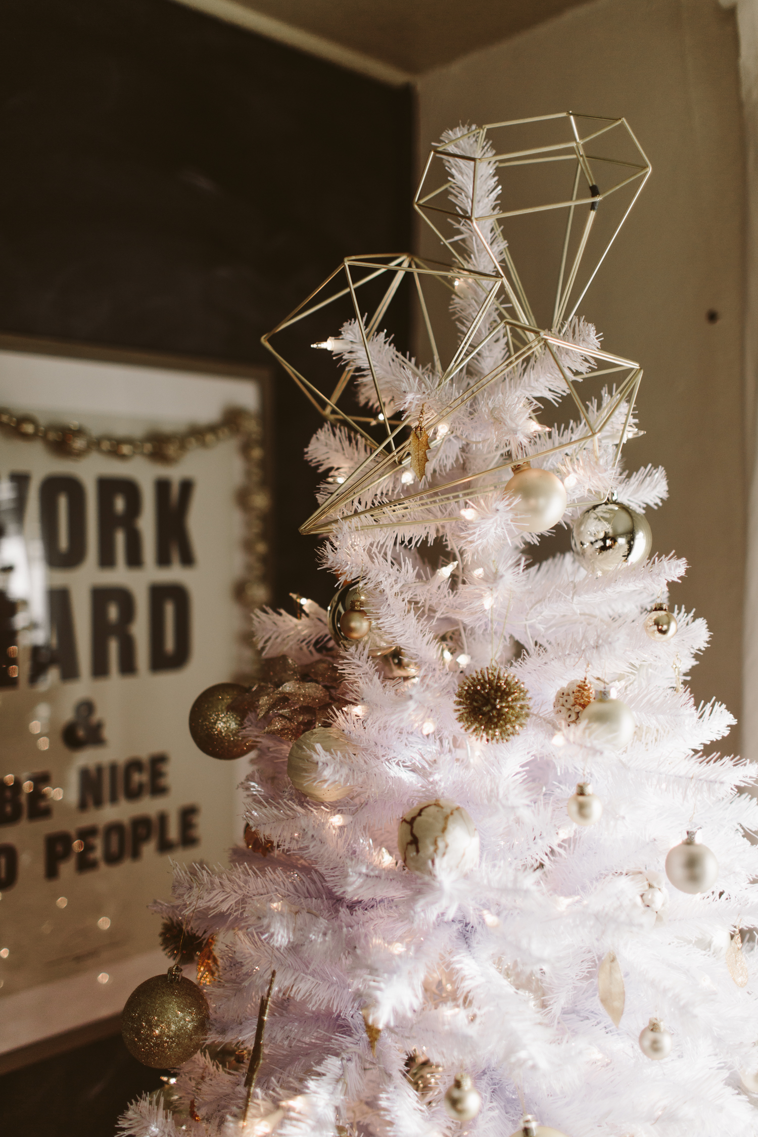
Tree Topper: Amazon
Ornaments: Thrifted

You may also like:
Fresh & light-filled Kitchen Before + After
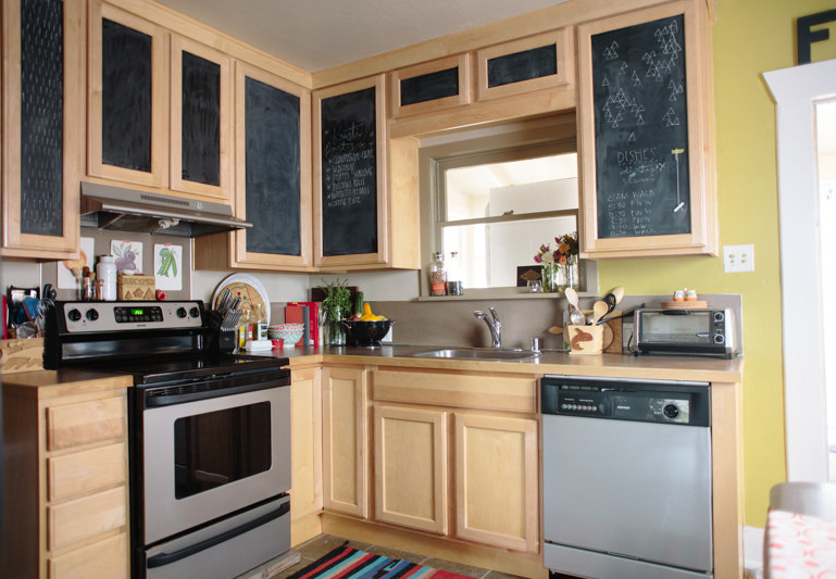
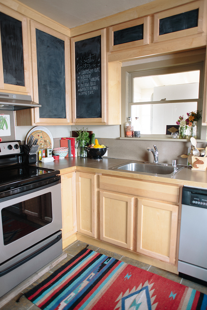
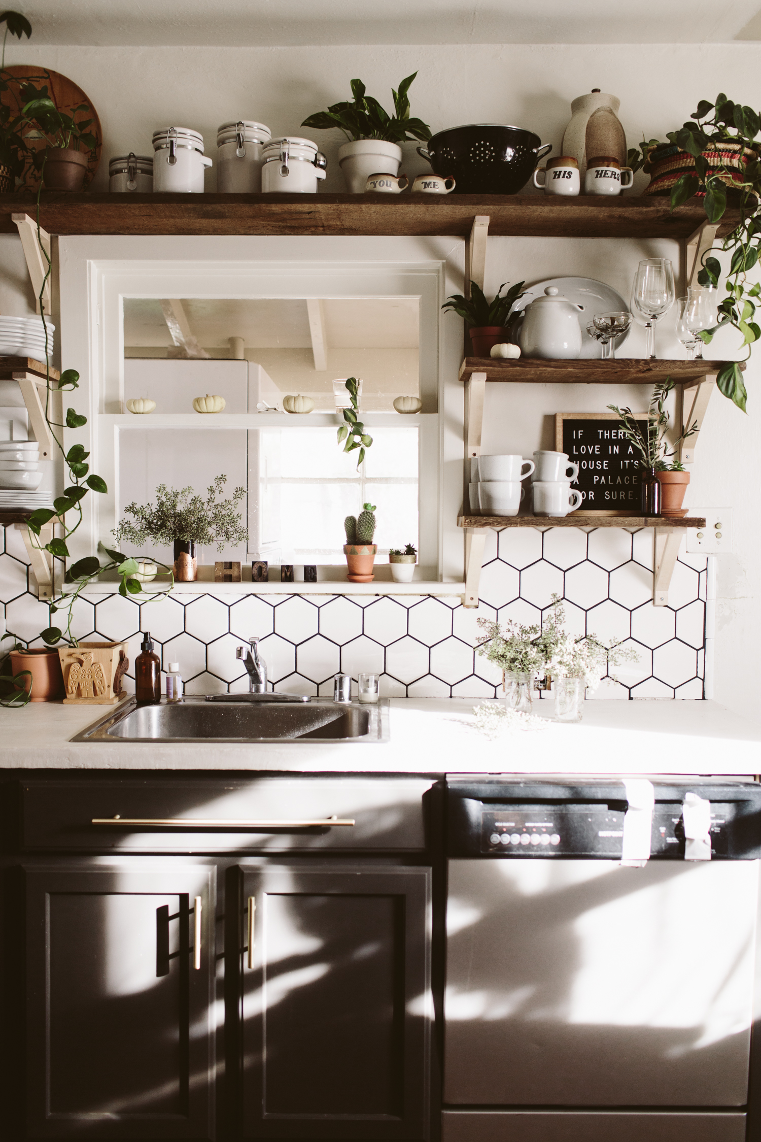
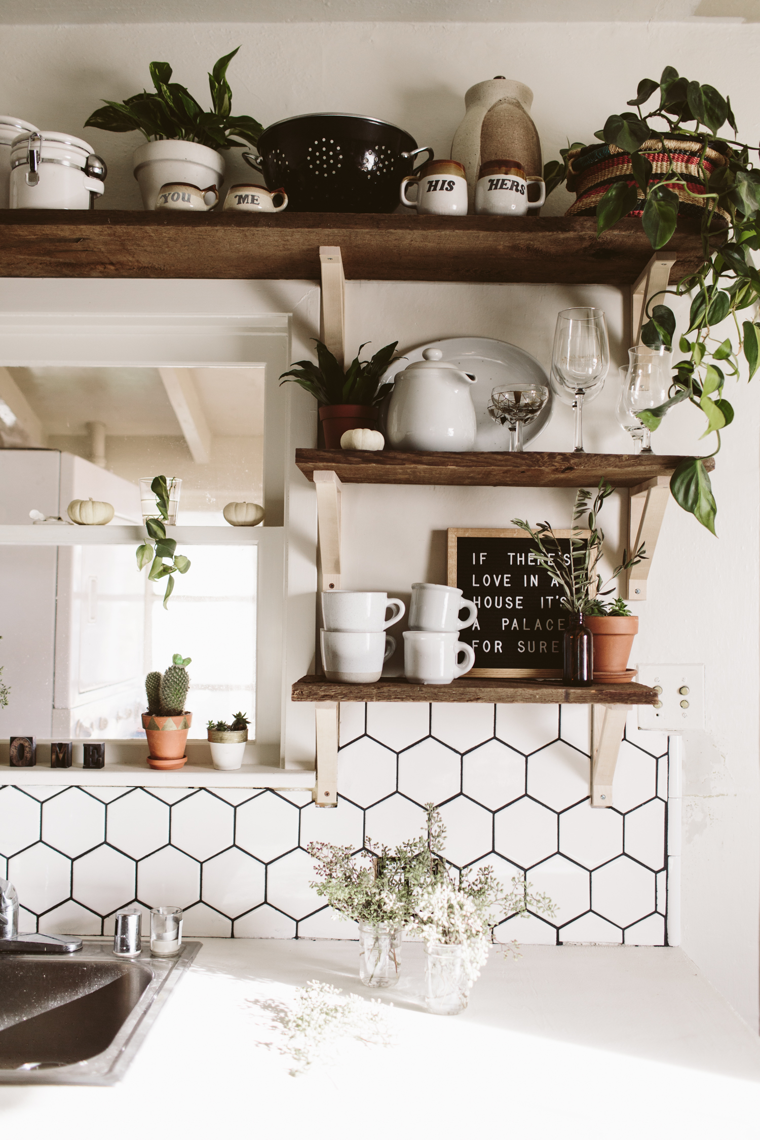
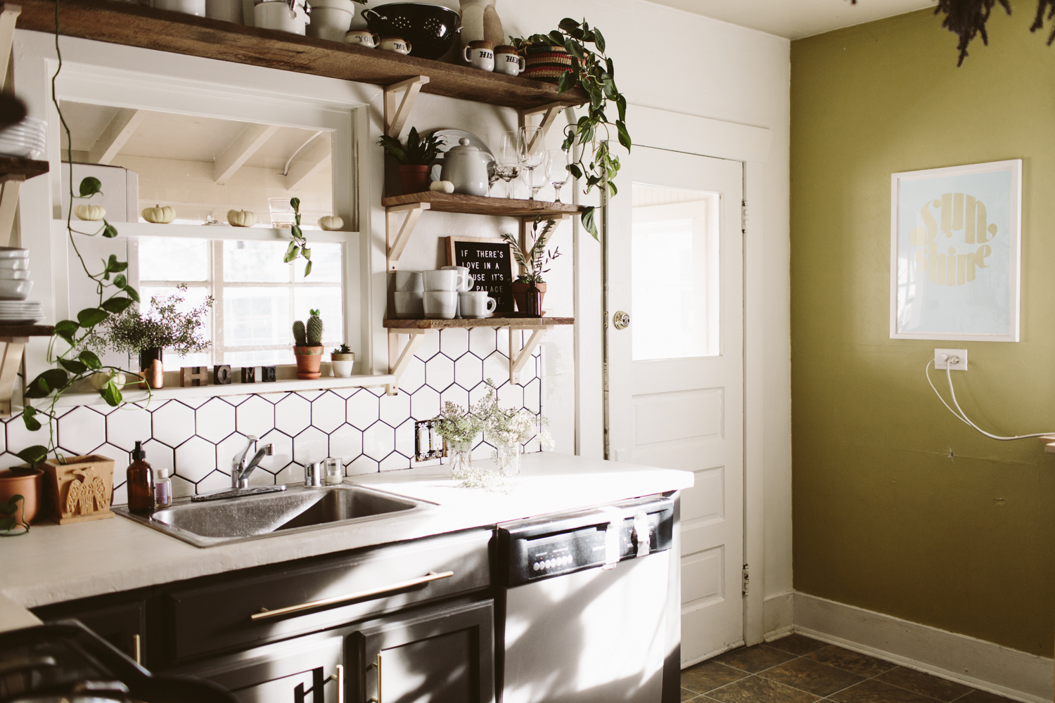
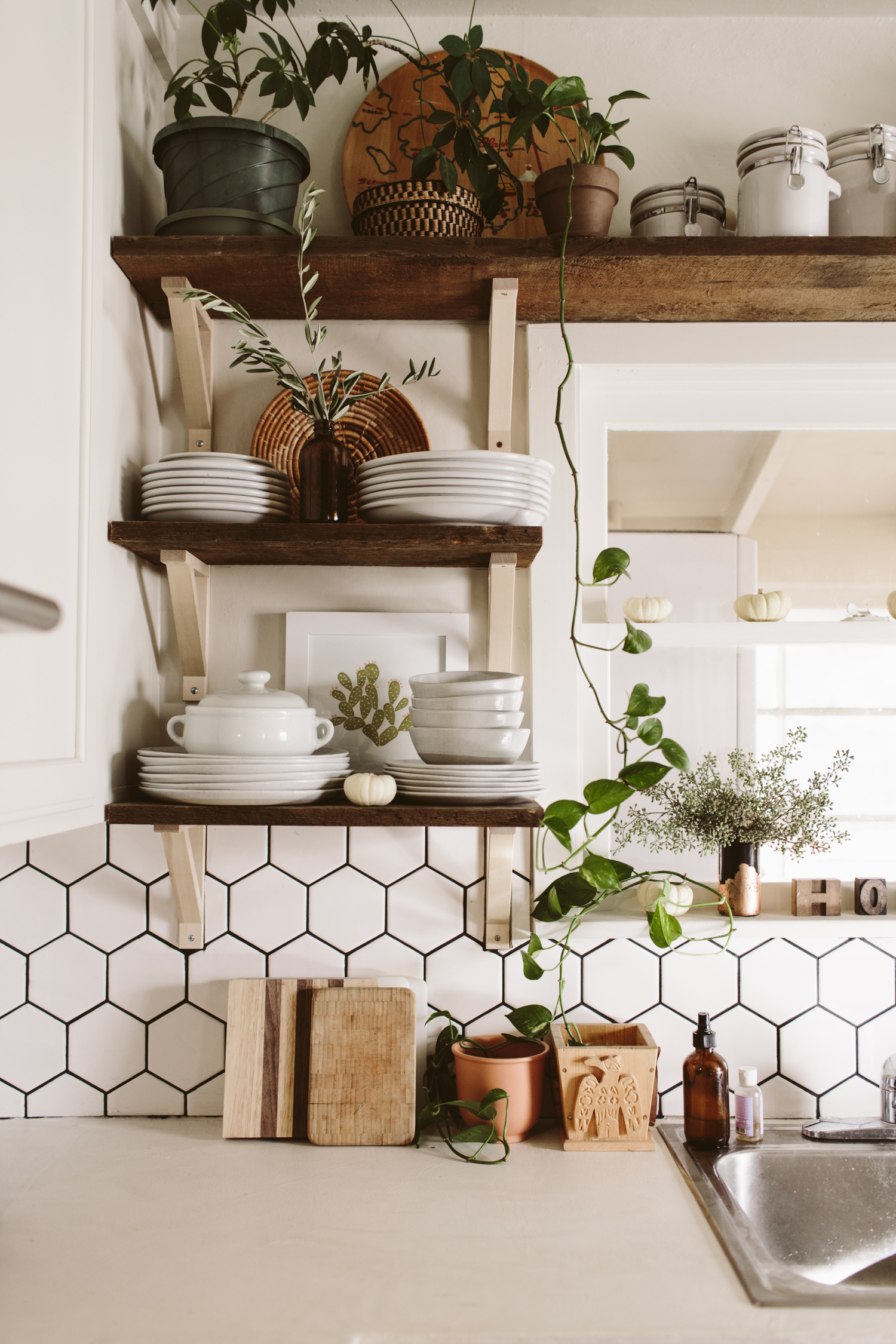
I still have a few odds and ends to button up on my kitchen remodel, but I grabbed these shots of the end result and I couldn’t resist sharing! (if you want to see my old kitchen before + after click here!)
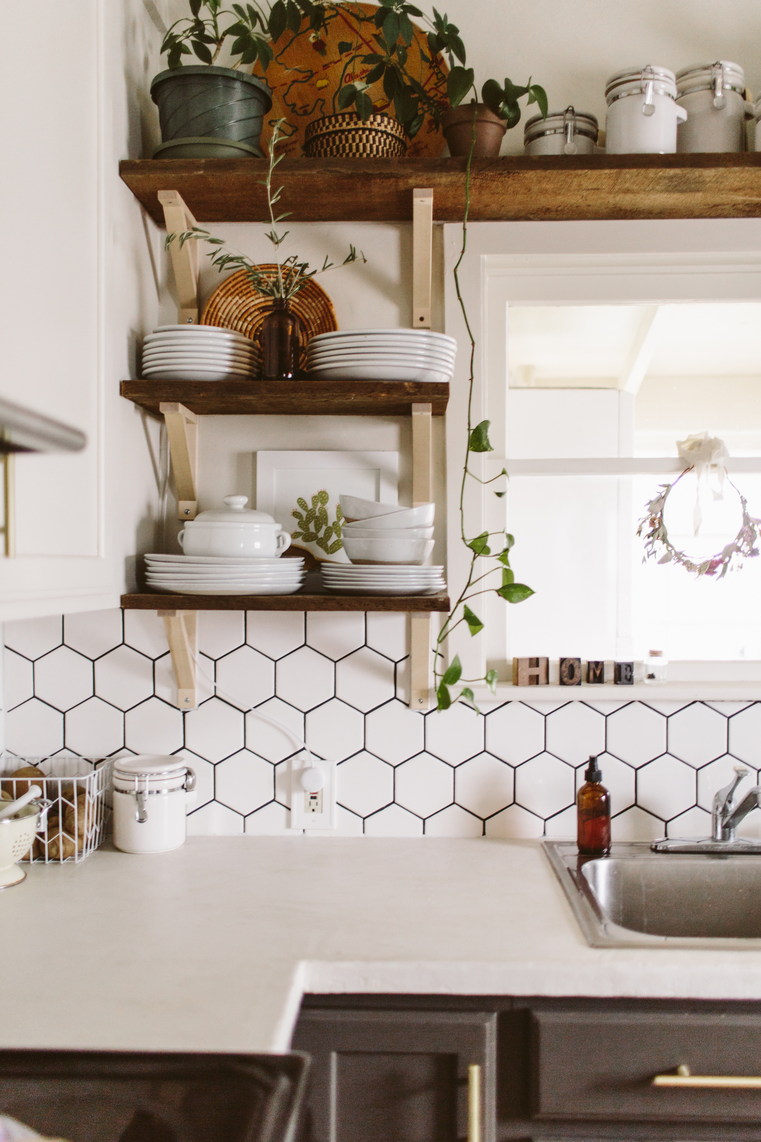
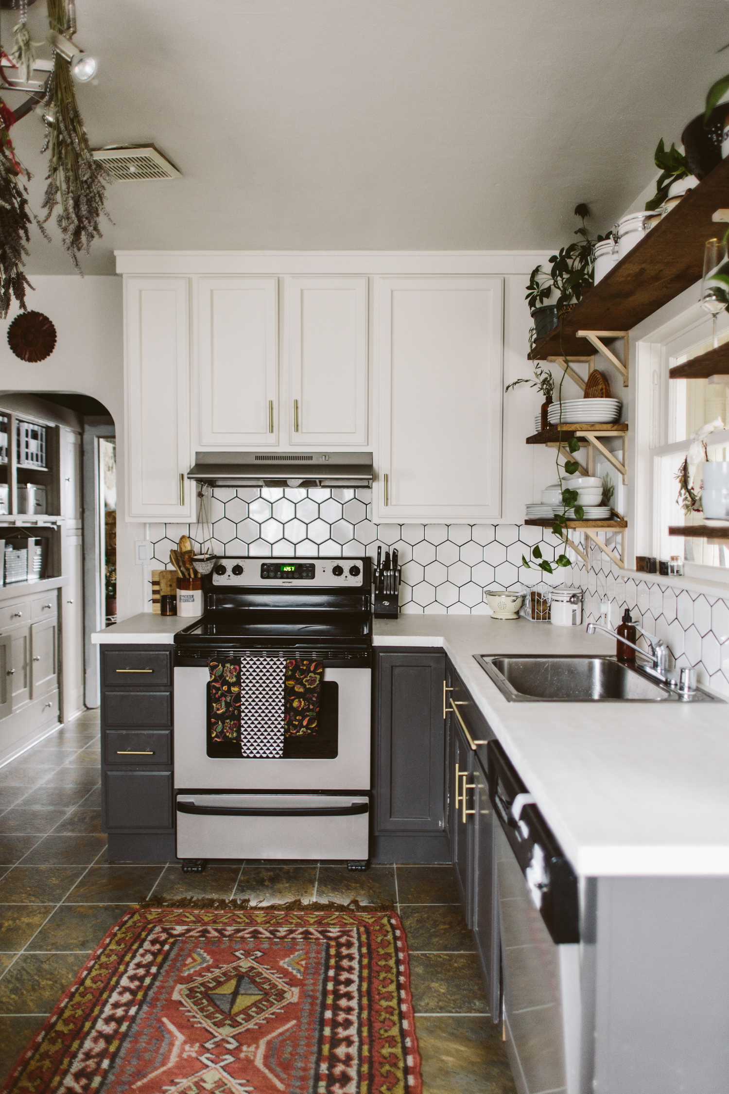
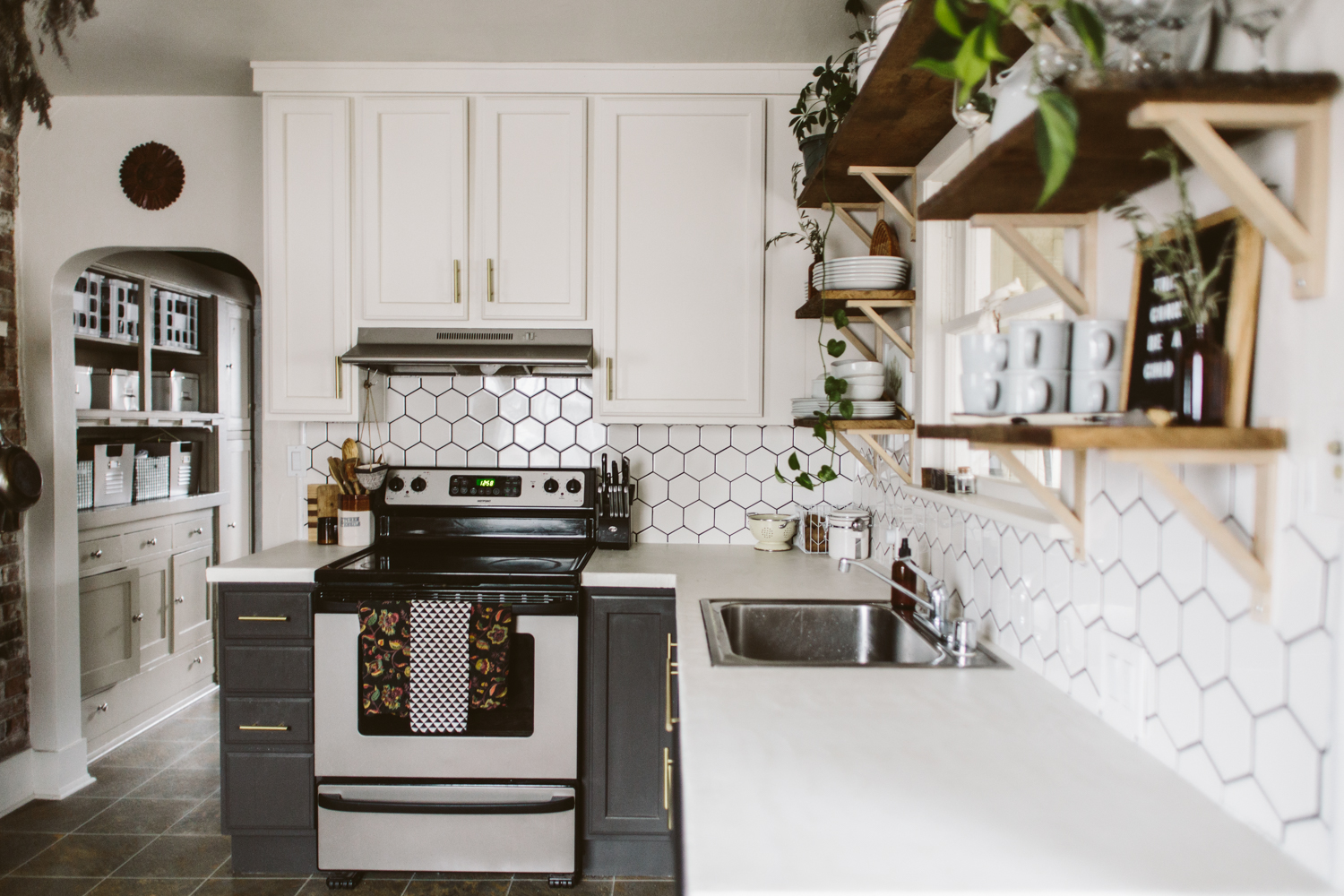
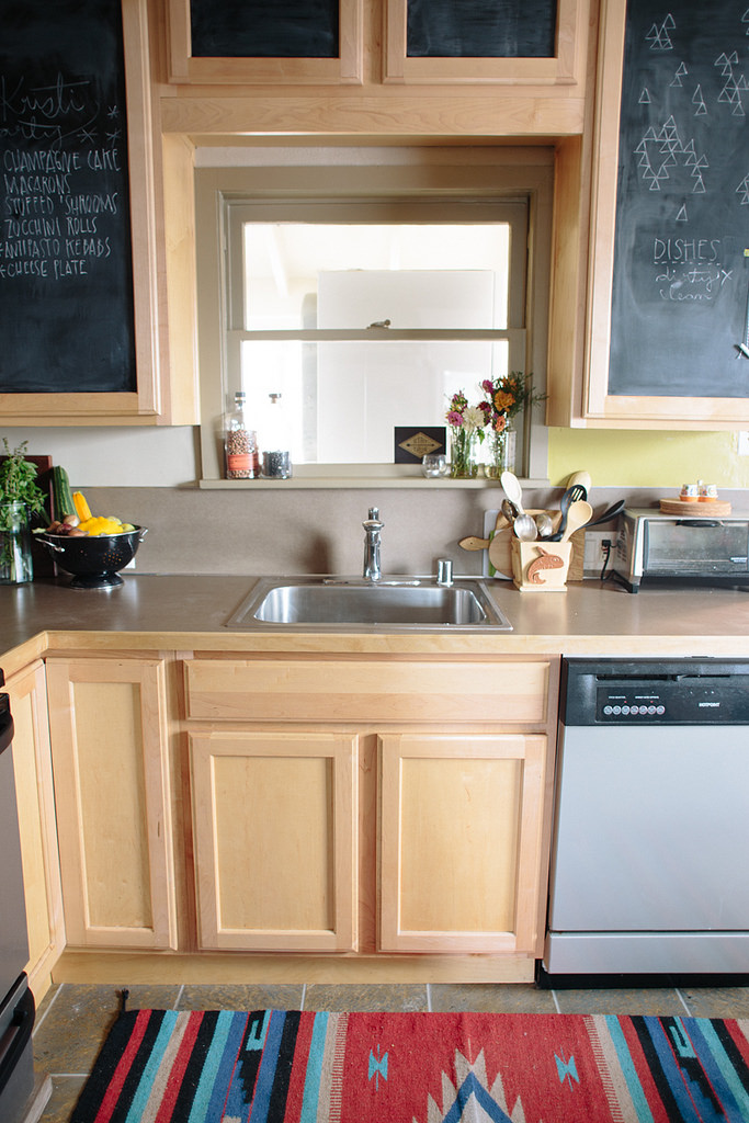
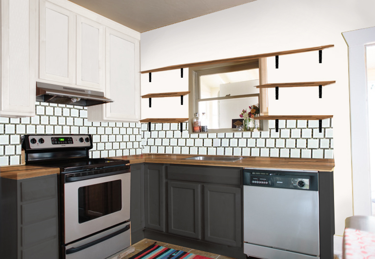
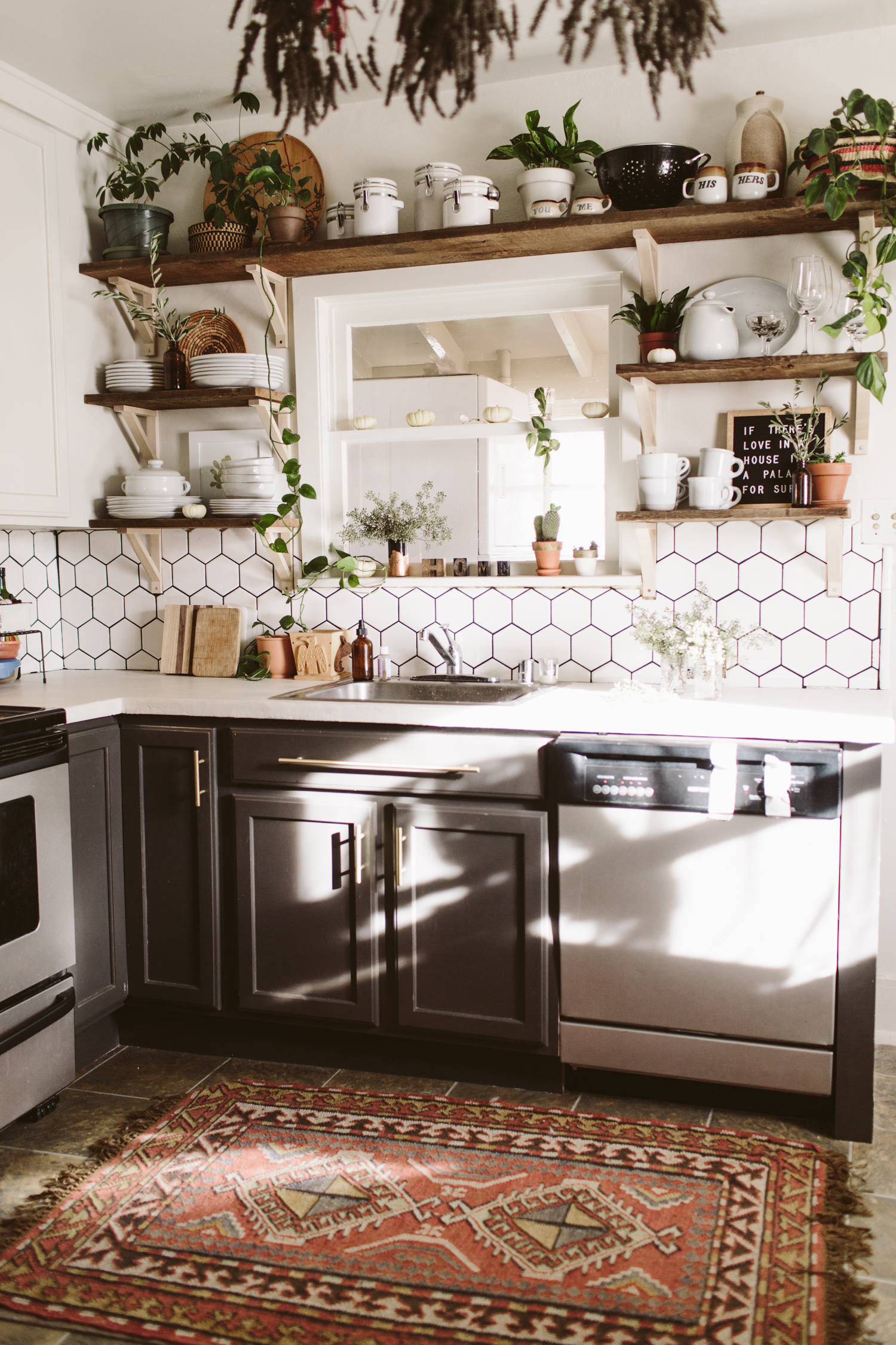
Below is the before, as well as my design plan. I ended up going with white concrete skim coat counters instead of the walnut butcher block which was my original plan. We simply skimcoated our existing formica counters with white concrete, which ended up being way more affordable, plus we wanted something durable and low maintenance, as we’re potentially going to turn this house into a rental in the near future. While I love me some butcher block counters, having something that needed regular upkeep and could get ruined by someone putting a hot pan on the counter seemed like not the best idea for a rental.
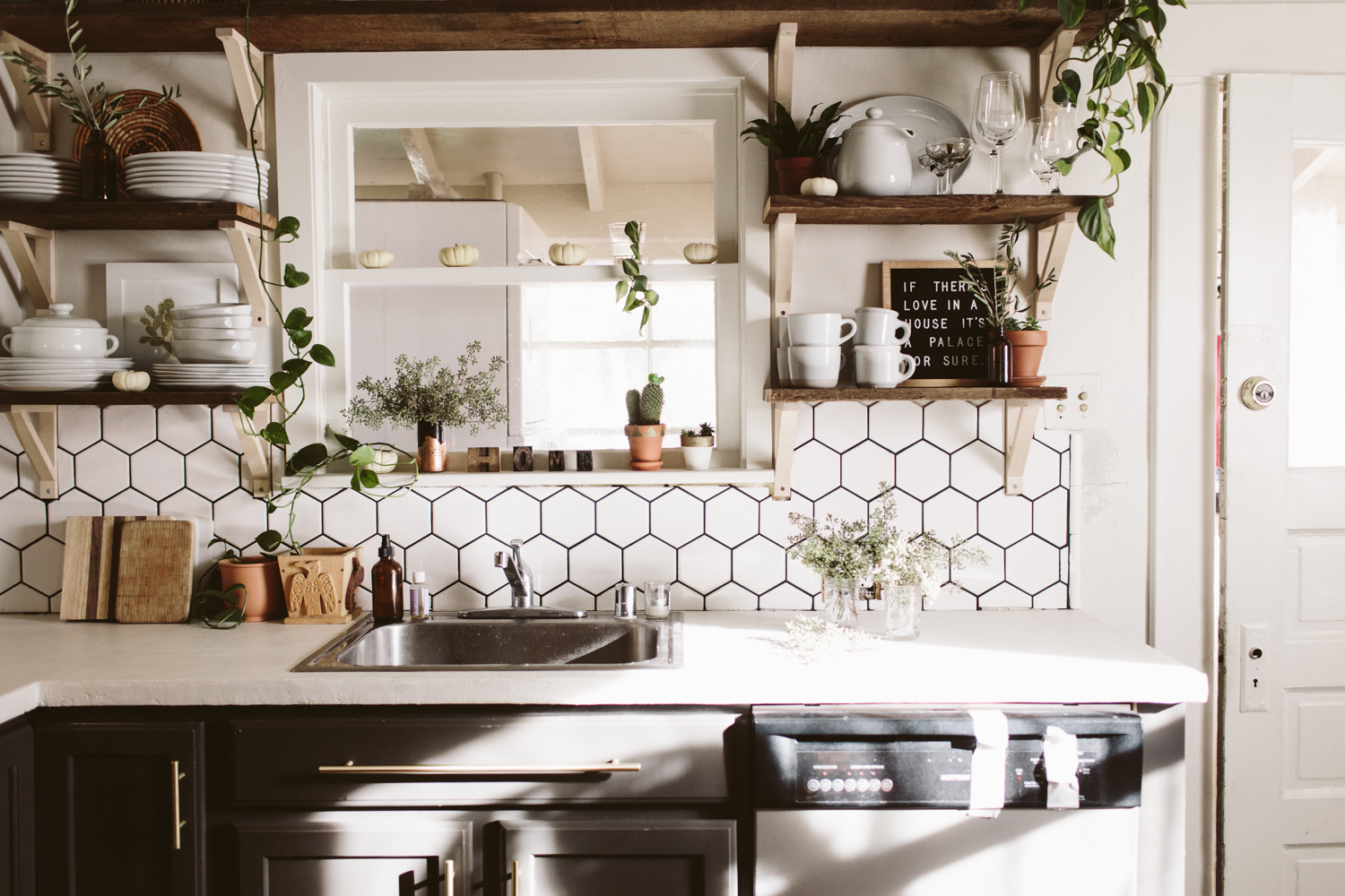
I took out the east wall upper cabinets and had to do quite a bit of wall repair, but it looks lovely now and I like how much more bright and open it is in here! The remaining upper cabinets I painted white (Glidden Cappuccino white, which is the white in my whole house), and the lowers were painted Behr Iron Mountain. None of the cabinets had pulls, so I added brass pulls from Target.
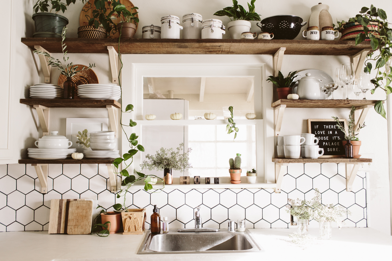
My original plan was to do white square 4x4 tiles in an offset subway tile pattern but I ended up going with hexagonal white tiles and I’m really glad I did, I love that they are white and neutral, but have a more interesting pattern than the standard subway look.
Anyway, scroll down to see the transformation and I’ll put links to the products I used at the bottom!
Dying to transform your own kitchen, but aren’t sure where to start, how to bring your vision to life, or need help figuring out how to make it all happen? I’ve got you covered! Head over here and let’s get started on working some design magic for you!
Want to recreate this design in your home? Get all the details and finishes on this design in my Design Kickstart! Moodboard, Budget Breakdown, and Source Links are all included so you can hit the ground running on transforming your own kitchen in to a bright + fresh space.
You may also like:
Hi, I’m Liz
I'm an artist, writer, designer, DIY renovator, and … well basically I like to do all the things. If it’s creative I’m probably doing it. I’ve spent over 30 years voraciously pursuing a life steeped in creativity and I wholeheartedly believe creativity and joy are inextricably linked.
Read more…
Explore The Archive
- January 2026
- July 2025
- May 2025
- January 2025
- December 2024
- August 2024
- July 2024
- May 2024
- April 2024
- January 2024
- December 2023
- October 2023
- September 2023
- July 2023
- June 2023
- May 2023
- April 2023
- March 2023
- February 2023
- January 2023
- December 2022
- November 2022
- October 2022
- August 2022
- June 2022
- May 2022
- April 2022
- March 2022
- November 2021
- October 2021
- August 2021
- July 2021
- May 2021
- January 2021
- November 2020
- October 2020
- September 2020
- August 2020
- July 2020
- June 2020
- May 2020
- April 2020
- February 2020
- January 2020
- November 2019
- October 2019
- August 2019
- July 2019
- June 2019
- May 2019
- April 2019
- February 2019
- January 2019
- December 2018
- November 2018
- October 2018
- September 2018
- August 2018
- July 2018
- June 2018
- May 2018
- April 2018
- February 2018
- January 2018
- November 2017
- September 2017
- August 2017
- July 2017
- June 2017
- May 2017
- April 2017
- March 2017
- February 2017
- January 2017
- December 2016
- November 2016
- October 2016
- September 2016
- August 2016
- June 2016
- May 2016
- April 2016
- March 2016
- February 2016
- January 2016
- December 2015
- November 2015
- October 2015
- September 2015
- August 2015
- July 2015
- June 2015
- May 2015
- April 2015
- March 2015
- February 2015
- January 2015
- December 2014
- November 2014
- October 2014
- September 2014
- August 2014
- July 2014
- June 2014
- May 2014
- April 2014
- March 2014
- February 2014
- January 2014
- December 2013
- November 2013
- October 2013
- September 2013
- August 2013
- July 2013
- June 2013
- May 2013
- April 2013
- March 2013
- February 2013
- January 2013
- December 2012
- November 2012
- October 2012
- September 2012
- August 2012
- July 2012
- June 2012
- May 2012
- April 2012
- March 2012
- February 2012
- January 2012
- December 2011
- November 2011
- October 2011
- September 2011
- August 2011
- July 2011
- June 2011
- May 2011
- April 2011
- March 2011
- February 2011
- January 2011
- December 2010
- November 2010
- October 2010
- September 2010
- August 2010
- July 2010
- June 2010
- May 2010
- April 2010
- March 2010
- February 2010
- January 2010
- December 2009
- November 2009
- October 2009
- September 2009
- August 2009
- July 2009
- June 2009
- May 2009
- April 2009
- March 2009
- February 2009
- January 2009
- December 2008
- November 2008
- October 2008
- September 2008
- August 2008
- July 2008
VISIT THE SHOP
PRIVACY POLICY & DISCLOSURE
We are a participant in the Amazon Services LLC Associates Program, an affiliate advertising program designed to provide a means for us to earn fees by linking to Amazon.com and affiliated sites.


